


Forms are where good products go to die quietly.
The average online form completion rate is 51.7%. Nearly half the people who start your form abandon it. And this is often the last step before a signup, a purchase, or a lead, the exact moment where all your upstream work either pays off or evaporates.
Here is the frustrating part: teams pour money into landing pages, hero images, and copy, then ship a form that asks for too much and handles errors badly. The form looks fine. It performs terribly. That gap between “looks fine” and “actually converts” is one of the most common and costly mismatches in all of web design. This issue is what the research says to fix, in order of impact.
In this issue:
Why forms leak so many people
Field count is the real killer
The sequencing trick worth 18%
The small fixes with outsized returns
A quick audit for your own forms
Resource Corner
Why forms leak so many people
Start with the baseline so you know what you are working against.
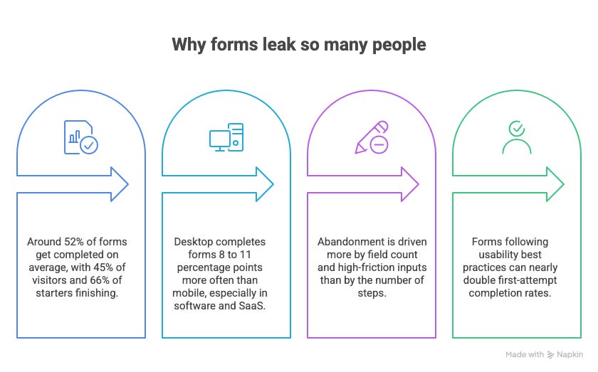
Around 52% of forms get completed on average. Of people who merely visit a form, 45% finish. Of people who actually start one, about 66% finish. Either way, a large chunk vanishes mid-task. And mobile makes it worse: desktop completes forms 8 to 11 percentage points more often than mobile, and the gap is widest in software and SaaS.
The single most important finding, and the one that reorders most teams’ priorities: abandonment is driven more by field count and high-friction inputs than by the number of steps. Teams obsess over reducing steps in a flow. The data says the bigger lever is reducing what you ask for on each screen. A five-step form with few fields per step often beats a one-page form with thirty fields crammed in.
The good news buried in all this: forms following usability best practices can nearly double first-attempt completion rates. The upside is enormous, and most of it is small work.
Field count is the real killer
If you fix one thing, fix this. The number of fields is the strongest predictor of whether people finish.
The pattern is stark. A 10-question lead form averages 28% lower completion than a 3-question one. Form success follows a curve: demo-booking forms with 1 to 3 fields succeed 41% of the time, peak at 51% with 4 to 6 fields, then fall to 31% at 7 or more.
And most forms ask for far more than they need. Checkouts commonly display 11 to 13 fields when only 8 to 9 are genuinely required. That is three or four unnecessary exits built right into the form. Meanwhile, home page forms are getting worse, not better, averaging 6.9 inputs in 2026, a 36% increase in three years.
The fix is ruthless subtraction. Go through your form field by field and ask, for each one, whether you truly need it now or are collecting it just in case. Almost every form has one or two fields that can be cut immediately. There is a nuance worth knowing: a field the user sees as justified, one that clearly earns them a more personalized result, can be added without hurting completion. But the burden of proof is on the field. If it cannot justify itself, it goes.
The sequencing trick worth 18%
Here is a fix that costs nothing and most teams miss entirely: the order of your fields matters as much as the number.
Forms that open with easy fields like name and email, saving the demanding questions for later, get 18% higher completion than forms that front-load the hard stuff. The psychology is simple. Once someone has invested a few easy answers, they are more committed to finishing. Hit them with the hard question first and they bail before they are invested.
Related finding: putting a question on the welcome screen correlates with a 5% lower completion rate. Do not make people answer before they have even started. Let them ease in.
Even tone plays a measurable role. Forms with positive, friendly sentiment get 17% more completions than negative or cold ones. The words around your fields are not decoration. They affect whether people finish.
So: easy fields first, hard fields last, warm language throughout. Free to implement, and worth double-digit gains.
The small fixes with outsized returns
Beyond field count and order, a handful of specific, research-backed changes punch above their weight.
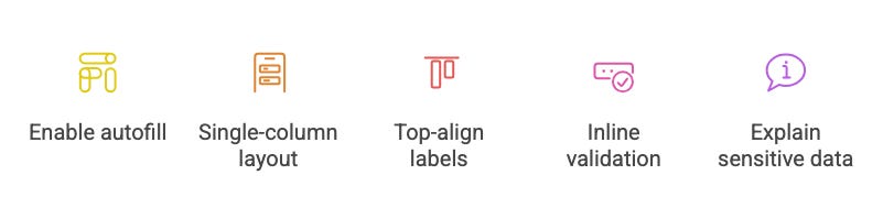
✅ Enable autofill. This one is almost unfair. Autofill-friendly forms complete 35 to 40% faster with 70 to 80% lower abandonment. Making sure your fields use correct input types and autocomplete attributes is one of the highest-return, lowest-effort changes available.
✅ Use a single-column layout. Single-column forms match natural vertical scanning, lower cognitive load, and consistently complete better than multi-column ones. The exception is short related pairs like City and State. Otherwise, stack everything in one column.
✅ Top-align your labels. Top-aligned labels produce faster completion and fewer errors than left or right-aligned labels in nearly every context. A small layout choice with a real accuracy payoff.
✅ Use inline validation. Show errors as the user leaves a field, not all at once on final submit. Inline validation significantly cuts re-submission rates and the frustration that causes abandonment. Password and contact fields are the most common exit points, so they are where good validation matters most.
✅ Explain why you need sensitive data. Forms that clearly explain why a piece of sensitive information is required complete meaningfully better than those that do not. A one-line “we use this to X” next to a phone or address field removes the hesitation that makes people quit.
A quick audit for your own forms
Run this on your highest-traffic form this week.
▸ Count the fields. Then remove every one that is not essential right now. Aim for the 4-to-6 sweet spot where completion peaks.
▸ Reorder them. Easy fields (name, email) first. Hard or sensitive fields last. No question on the welcome screen.
▸ Turn on autofill. Check that input types and autocomplete attributes are set correctly. This alone can cut abandonment dramatically.
▸ Switch to one column, top-aligned labels. Fast to change, measurable gains.
▸ Add inline validation and a reason for any sensitive field. Fix the password and contact fields first, since they leak the most.
▸ Track where people drop off. Set up field-level analytics so you can see exactly which field is causing exits, then fix that one first.
Quick pause. This belongs in the room.
🎯 UXCON26 · One Day · The Whole Community

The unglamorous craft that quietly decides whether products convert, like the humble form, is exactly what the field sharpens best together, in person.
On October 8, 2026, the UX community gathers for a full day on doing this work better. Headlining is Don Norman, who coined the term user experience and wrote the book on why small design details carry outsized weight. Alongside him: practitioners from Netflix, The New York Times, Target, UserTesting, and Skylight, hosted by Jeremy Miller of the Beyond UX Design podcast.
Three keynotes. Two panels. One room.
📦 Resource Corner
75+ Online Form Statistics 2026 (Crazy Egg)
The most comprehensive current dataset on form completion, field counts, and sequencing, including the 18% gain from easy-fields-first. The source behind most numbers here. Bookmark it.
Form UX Best Practices (ALF Design Group)
A clean summary of the NN/G form research, single-column layouts, top-aligned labels, inline validation, that can nearly double completion. Directly actionable.
Online Form Statistics 2026 (pdfFiller)
Strong on the field-count-versus-steps insight and the autofill data. Practical, benchmark-driven, and good for setting your own targets.
Web Form Design and Usability (Nielsen Norman Group)
The authoritative research hub on form usability. Deep, evidence-based guidance on every element of form design. Where to go when you want the underlying studies.
Form Design Patterns by Adam Silver
The definitive book on designing accessible, high-converting forms. Practical, opinionated, and the best single resource if forms are a core part of your product.
💭 Final Thought
Forms are boring, which is exactly why they are neglected, and exactly why fixing them is such an easy win.
Half your users are leaving at the finish line, and the fixes are mostly free: fewer fields, better order, autofill, clear errors. No new features, no acquisition spend. Just a form that respects the person filling it out.
Open your highest-traffic form. Count the fields. Start cutting.


