


Remember when you became a designer because you wanted to create things? Now you spend most of your day choosing between three approved button variants and arguing about 4px vs 8px spacing. Your design system was supposed to make you faster. Instead, it’s made you a glorified component assembler. Every screen feels the same. Every decision is already made. And you’re starting to forget what it feels like to actually design something.
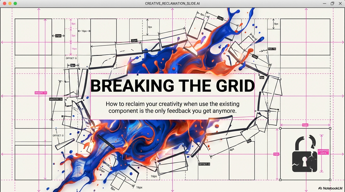
Here’s how design systems went from helpful tool to creative straitjacket, and what you can do about it.
In this issue:
When “consistency” became code for “boring”
The components you’re not allowed to break (and why that’s a problem)
What gets lost when everything is systematized
How to stay creative inside rigid constraints
When to follow the system vs. when to fight it
📦 Resource Corner
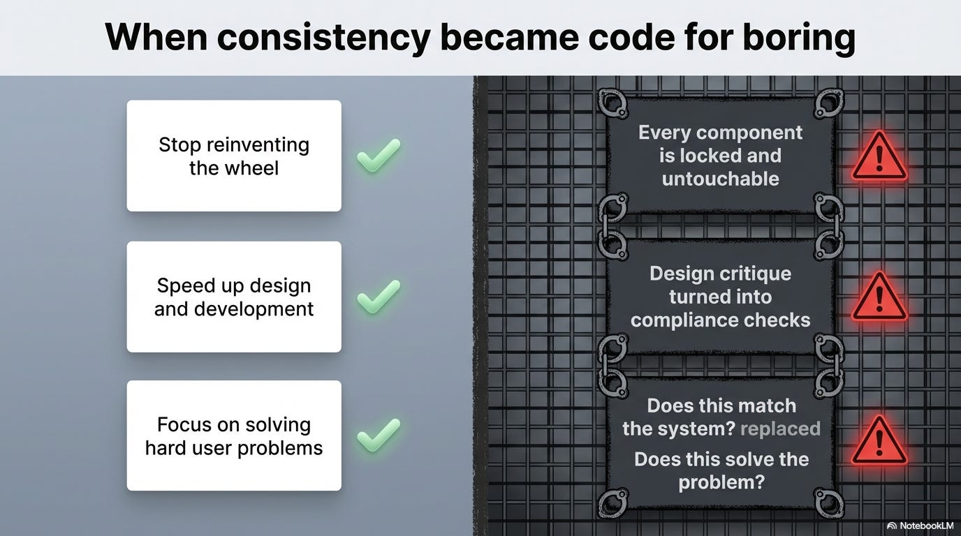
When “consistency” became code for “boring”
Design systems started with good intentions: ✅ Stop reinventing the wheel for every button ✅ Make products learnable through repeated patterns
✅ Speed up design and development ✅ Create cohesive experiences across products
But somewhere along the way, something broke.
Here’s what actually happened:
🔴 Consistency became the goal instead of the tool
Design systems were supposed to make consistency easy so you could focus on solving hard problems. But now consistency is the only thing that matters. “Does this match the system?” replaced “Does this solve the user’s problem?”
🔴 Every component became locked and untouchable
Early design systems had foundations (color, typography, spacing) and suggested patterns. Now they have rigid components with strict usage rules. You can’t adjust padding. You can’t change hierarchy. You can’t combine things in new ways. The system says no.
🔴 Design reviews became compliance checks
“Why didn’t you use the standard card component?” “This button treatment isn’t approved.” “We already have a pattern for this, use that.”
Design critique turned into design enforcement. You’re not evaluated on problem-solving anymore. You’re evaluated on rule-following.
🔴 Speed became more valuable than quality
“Just use existing components” is faster than designing something custom. So teams optimize for speed. But fast and good aren’t the same thing. You end up with products that work fine but feel generic and forgettable.
🔴 Junior designers never learn to design
If your entire job is “choose components from the library and arrange them in approved layouts,” you never develop design judgment. You never learn how to solve problems from first principles. You become a component operator, not a designer.
The result?
Every SaaS product looks identical. Same cards. Same buttons. Same layouts. Same typography. Same everything. Users can’t tell companies apart anymore. Brands have no visual personality. And designers feel creatively dead inside.
The components you’re not allowed to break (and why that’s a problem)
Let’s talk about what “locked components” actually means in practice.
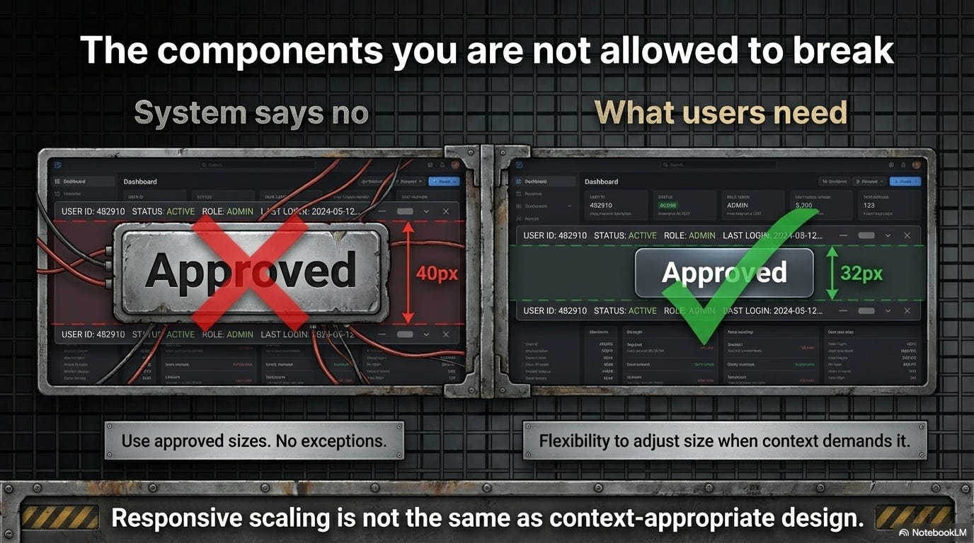
Scenario 1: The button that doesn’t work for your use case
Your design system has a button component:
Primary: 40px tall, 16px padding, bold text
Secondary: 40px tall, 16px padding, regular text
Tertiary: text link style
But you’re designing a dashboard with tight vertical space constraints. The 40px buttons feel massive and clunky. A 32px button would work better.
❌ System says: “Use the approved button sizes. No exceptions.”
✅ What you need: Flexibility to adjust size when context demands it.
Why it matters: Rigid adherence to components makes your design worse for users just to satisfy internal consistency rules.
Scenario 2: The card that forces bad hierarchy
Your card component has fixed structure:
Icon top-left
Title below
Description below that
Action buttons bottom
But for your specific use case, you need the action button prominent and the description de-emphasized. The standard card forces the wrong visual hierarchy.
❌ System says: “That’s not how cards work. Use the standard pattern.”
✅ What you need: Compositional flexibility to arrange elements based on user needs, not template rules.
Why it matters: Good information hierarchy depends on context. One-size-fits-all components can’t adapt to different content priorities.
Scenario 3: The navigation that assumes desktop patterns
Your navigation component is designed for desktop:
Horizontal nav bar
Dropdowns on hover
Always visible
But on mobile, this pattern fails. You need something completely different. The system doesn’t have a mobile-specific navigation solution.
❌ System says: “Make the desktop nav responsive. Don’t create custom navigation.”
✅ What you need: Different patterns for fundamentally different contexts.
Why it matters: Responsive scaling isn’t the same as context-appropriate design. Mobile users need mobile patterns, not shrunk-down desktop patterns.
The pattern across all these:
Design systems optimize for reuse and consistency. But design quality often requires context-specific solutions. When the system blocks those solutions, you’re forced to choose between good design and approved design.
Most designers choose approved design because fighting the system is exhausting and career-limiting. So the product gets worse.
What gets lost when everything is systematized
Okay, so design systems create consistency and efficiency. Great. But what’s the cost? What do you lose when every decision is pre-made?
💔 Loss 1: Problem-solving skills
When every screen is assembled from pre-built components, you stop solving problems. You stop asking “what does the user need here?” and start asking “which components can I use?”
Junior designers today build portfolios by arranging system components in Figma. They never learn how to:
Analyze a complex problem and break it down
Explore multiple solution directions
Iterate based on user feedback
Make and defend design decisions from first principles
They learn component selection, not design thinking.
💔 Loss 2: Visual personality and brand differentiation
When every company uses the same design system components (Material, Bootstrap, Ant Design, Chakra), every product looks the same.
Blue buttons ✓
Sans-serif type ✓
Card-based layouts ✓
8px grid ✓
Pastel colors ✓
There’s no visual point of view. No personality. No memorable design. Just competent sameness.
Brand becomes logo and color scheme, not holistic design language.
💔 Loss 3: Context-specific solutions
Some problems need custom solutions. A data visualization dashboard needs different components than a social media feed. A medical records interface needs different patterns than a project management tool.
But design systems encourage generic solutions that work “most places.” The 80% solution becomes the 100% requirement. Edge cases get forced into standard components even when it creates a worse experience.
💔 Loss 4: Experimentation and learning
Design systems encode past learnings. They capture what worked before. But they also prevent new learning.
When you can’t try new things because “we already have a pattern for that,” you stop discovering better solutions. The system becomes stagnant. Innovation happens outside your product, and you’re stuck with legacy patterns.
💔 Loss 5: Designer agency and satisfaction
Let’s be honest: arranging pre-made components isn’t creatively fulfilling.
Designers got into this field to solve problems and create things. Being told “just use the existing component” for every screen is soul-crushing. You feel like an assembler, not a designer.
This leads to burnout, disengagement, and good designers leaving for roles where they can actually design.
The tradeoff:
→ You gain: Speed, consistency, scalability, ease of handoff
→ You lose: Creativity, context sensitivity, learning, differentiation, fulfillment
For many companies, that tradeoff is worth it. But nobody admits what’s being lost. And designers are the ones paying the price.
💡 Reality check: If you can be replaced by someone who just knows how to use your component library, you’re not doing design work anymore.
Quick pause. This one’s important.
🎯 UXCon26: Where Design Thinking Still Matters
You know what’s not at UXCON26? A bunch of talks about how to use Figma components faster.

You know what is there? Designers solving actual problems. Designers breaking rules intentionally. Designers who still remember that the job is about users, not systems.
The talks on creativity, on when to break your own guidelines, on balancing consistency with innovation… those aren’t abstract theory. They’re survival skills for designers who want to still be designing five years from now instead of just component-shopping.
Plus, honestly? The best conversations happen after sessions. With designers who get it. Who feel the same creative frustration you do. Who’ve figured out how to stay creative inside constraints.
The people who show up are the ones who still care about craft. Just saying.
Let’s talk solutions.
How to stay creative inside rigid constraints
Okay, you’re stuck with a design system. You can’t burn it down and start over. How do you actually stay creative and do good work within those limits?
Strategy 1: Master the fundamentals the system is built on
→ Understand the why behind system decisions
→ Learn color theory, typography, spacing principles deeply
→ Study the psychology behind interaction patterns
Why this helps: When you understand principles, you can make better decisions even with limited options. You become strategic about which components to use and how to combine them. You’re not just following rules; you’re applying knowledge.
Strategy 2: Find the flexibility hiding in the system
Most design systems have more flexibility than designers realize:
✓ Design tokens you can customize per-screen
✓ Composition patterns that let you build new layouts from primitives
✓ Theming options that change the feel without breaking patterns
✓ Spacing and sizing scales that allow variation within constraints
Why this helps: You work with the system instead of against it. You find creative solutions that still feel cohesive but aren’t cookie-cutter identical to everything else.
Strategy 3: Document your “breaking the rules” decisions
When you need to go off-system:
1️⃣ Document why the standard component doesn’t work
2️⃣ Show what user need you’re solving
3️⃣ Propose your solution with clear rationale
4️⃣ Make it a conversation, not a rebellion
Why this helps: You’re not just violating rules. You’re making a case for evolution. You’re treating the system as a living thing that should grow based on real needs.
Strategy 4: Build a “playground” space for experimentation
→ Personal projects outside work constraints
→ Design sprints where rules are temporarily suspended
→ Speculative redesigns that explore “what if”
→ Side projects that let you try wild ideas
Why this helps: You keep your creative muscles active even if your day job is constrained. You prevent complete creative atrophy. And sometimes playground ideas eventually influence the main product.
Strategy 5: Focus on the problems components can’t solve
Design systems handle the how of interface design. Focus on the what and why:
→ User research and insight generation
→ Information architecture and flow design
→ Problem definition and scope
→ Service design and ecosystem thinking
Why this helps: These are the high-value design problems. Components are implementation details. If you solve the hard strategic problems well, component assembly becomes trivial.
Strategy 6: Become the person who evolves the system
Instead of fighting the system from the outside:
✓ Join the design system team (if possible)
✓ Contribute new components based on real needs
✓ Run research on existing patterns and push for improvements
✓ Be the voice for flexibility and context-sensitivity
Why this helps: You influence the constraints rather than just enduring them. You make the system better for everyone, including yourself.
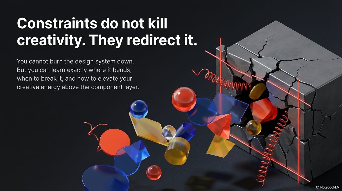
🎯 Take-home: Constraints don’t have to kill creativity. They just redirect it. The question is: do you stay creative within limits, or do you give up and become a component operator?
When to follow the system vs. when to fight it
Not every screen deserves custom design. Not every pattern should match the system. How do you know when to comply and when to push back?
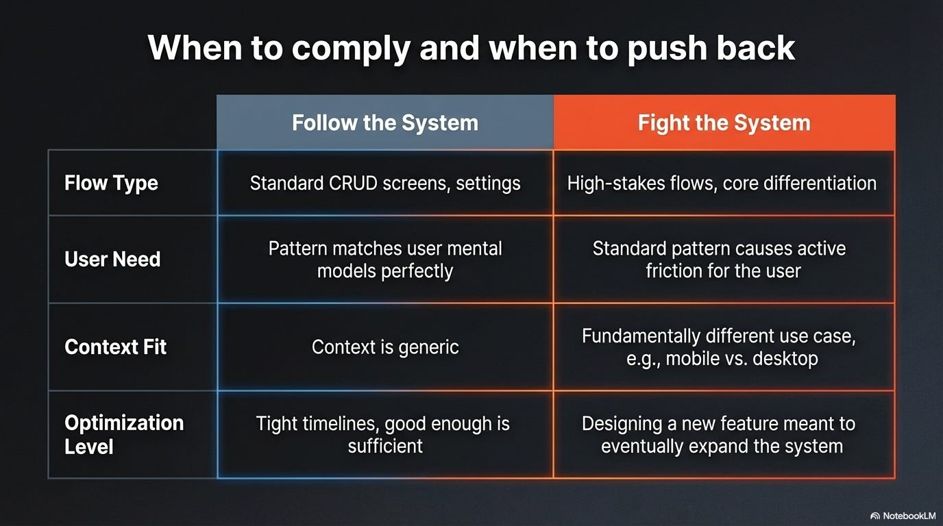
✅ Follow the system when:
→ You’re designing standard CRUD screens (lists, forms, settings)
→ The existing pattern genuinely solves the user problem well
→ Consistency is more important than optimization for this flow
→ You’re on a tight timeline and the system solution is good enough
→ Breaking the pattern would confuse users who’ve learned it elsewhere in the product
🔥 Fight the system when:
→ The standard component creates a genuinely worse user experience
→ You’re designing a high-stakes flow where context-specific optimization matters
→ Your use case is fundamentally different from what the system was designed for
→ The system pattern is outdated and doesn’t reflect current best practices
→ You’re working on a new feature that should eventually expand the system
The test: Ask yourself:
“Am I following the system because it’s genuinely the best solution, or because it’s easier/safer?”
If the answer is “easier/safer,” question it. If the answer is “best solution,” follow it confidently.
⚖️ How to fight the system effectively (without getting fired):
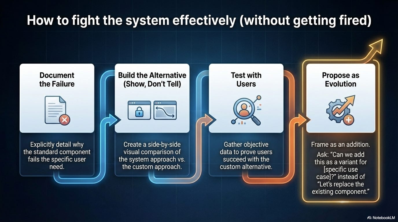
1. Show, don’t just tell
Build the alternative. Show it working. Compare it side-by-side with the system approach. Visual proof is more persuasive than arguments.
2. Frame it as evolution, not rebellion
“I think we’ve discovered a new pattern that could benefit the system” beats “the system is wrong and I’m breaking it.”
3. Test both approaches with users
User research gives you objective data. “Users struggled with the standard component but succeeded with this alternative” is hard to argue against.
4. Propose it as an addition, not a replacement
“Can we add this as a variant for [specific use case]?” is more likely to succeed than “let’s replace the existing component.”
5. Pick your battles
Don’t fight every constraint. Save your credibility for the decisions that genuinely matter to user experience.
📦 Resource Corner
Design Systems Handbook (DesignBetter)
Free resource on building flexible design systems. Good on when to systematize and when to leave room for creativity.
Atomic Design by Brad Frost
The methodology that started component-based thinking. Still valuable for understanding how to build composable rather than rigid systems.
Every Layout
CSS layout primitives that let you build flexible systems. Shows how to create rules without rigidity.
Material Design Customization
Even rigid systems like Material Design have customization options. Study how to use them.
Modulz/Radix Primitives
Component library built on composability. Example of a system that gives you building blocks instead of finished components.
Design System Office Hours (various communities)
Many design system teams run office hours where you can ask questions and get guidance on when to bend rules.
💭 Final Thought
Design systems aren’t evil. They solve real problems. They make teams faster and products more cohesive. The problem is when the system becomes more important than the work it was supposed to enable.
When “use the component” becomes the answer to every design question, you’ve stopped designing. When consistency is valued over user needs, you’ve lost the plot. When designers feel like assembly-line workers instead of problem solvers, something fundamental is broken.
The best design systems are guidelines, not laws. They make common things easy and custom things possible. They evolve based on real product needs instead of enforcing past decisions forever. They trust designers to think, not just comply.
If your design system is killing your creativity, you have three choices:
1️⃣ Leave and find a place that values design thinking
2️⃣ Become the person who evolves the system from within
3️⃣ Find creative space outside work and treat your job as execution-only
None of these are perfect. But all are better than slowly dying creatively while pretending everything is fine.
You became a designer to create things, solve problems, make experiences better. Don’t let a tool built to help you do that become the thing that stops you from doing it.
Fight for the space to design. The components will still be there when you need them.
--The UXU Team

