


You sent your portfolio link. The hiring manager opened it. Three minutes later, they moved on to the next candidate. Not because your designs are bad, they might be great. But because they couldn’t figure out what they were looking at. Unlabeled artboards. Random layer names. No clear explanation of what problem you solved or why. Your Figma file is a chaotic mess, and it’s screaming “I don’t have my shit together.”
Here’s why file organization matters more than you think, and how to fix it before your next application.
In this issue:
Why portfolio presentation kills more applications than bad design
What hiring managers actually look for in the first 60 seconds
The organization signals that separate juniors from seniors
How to structure case studies people actually want to read
The naming conventions that make you look professional
📦 Resource Corner
Why portfolio presentation kills more applications than bad design
Let’s be direct: most portfolios get rejected for presentation issues, not design issues.
Hiring managers look at 30-50 portfolios per role. They spend 2-3 minutes max on each one during initial screening. If they can’t quickly understand your work, they move on. It doesn’t matter how good the design is if they never get to it.
Here’s what kills portfolios instantly:
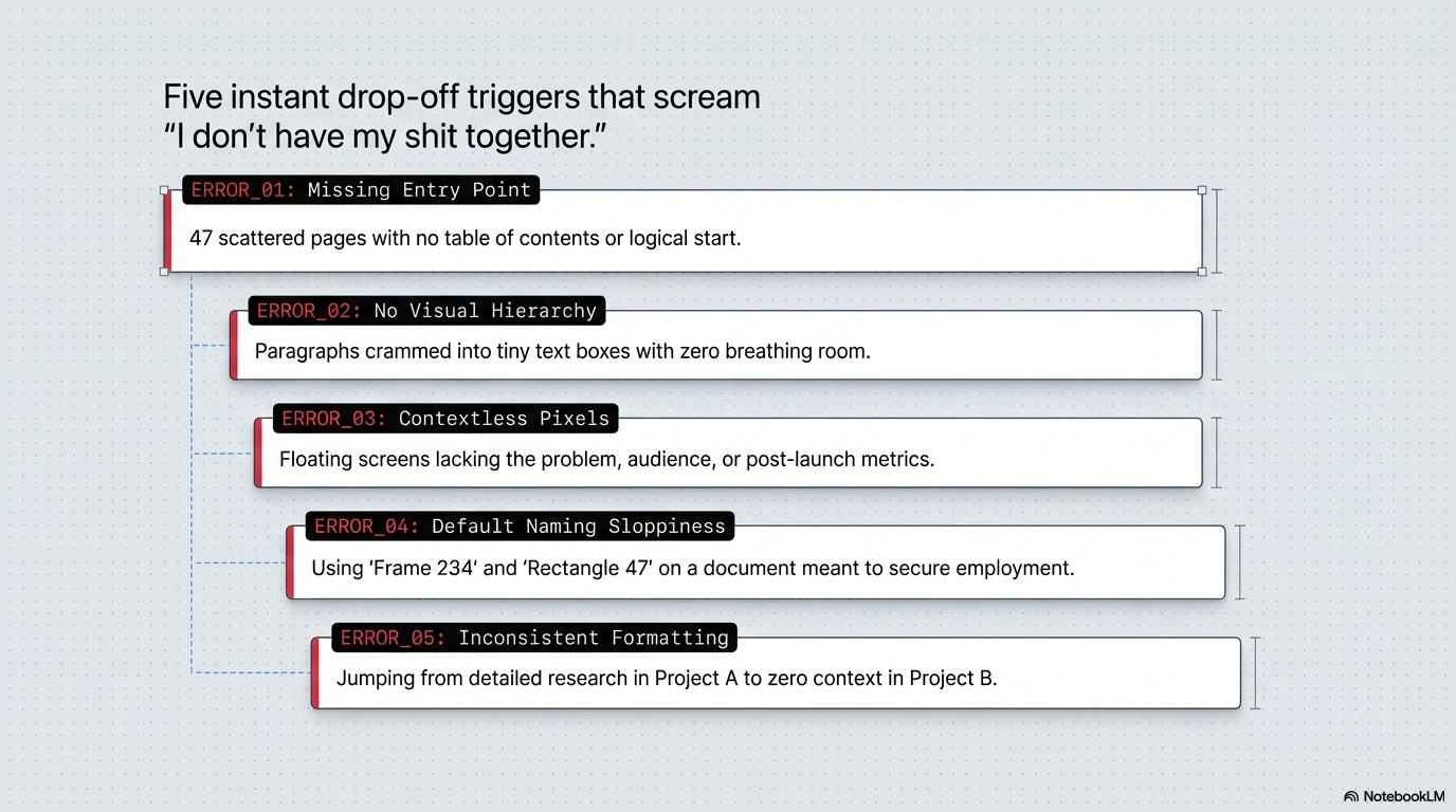
🚫 No clear entry point or structure
They open your Figma file and see 47 unnamed pages scattered randomly. No table of contents. No clear starting point. They have no idea where to begin or what order to view things.
🚫 Walls of text with no visual hierarchy
Paragraphs of explanation crammed into tiny text boxes. No headlines. No sections. No breathing room. Their eyes glaze over before they read a single word.
🚫 Designs with zero context
Beautiful screens with no explanation of what problem you were solving, who you designed for, or what happened after you shipped it. Just pretty pixels floating in space.
🚫 Layers and pages named “Frame 234” and “Rectangle 47”
This signals sloppiness. If you can’t be bothered to name things clearly in your portfolio (the thing you’re using to get hired), how will you work on a real team?
🚫 Inconsistent formatting across case studies
One project has detailed research. Another jumps straight to final designs. Another has process but no outcomes. The inconsistency makes you look unprofessional or inexperienced.
The brutal truth:
Presentation quality is a proxy for work quality. Hiring managers assume:
Organized files = organized thinking
Clear explanations = clear communication
Thoughtful structure = thoughtful process
Messy presentation = messy designer
Fair or not, that’s the reality. Your file organization is being judged as hard as your design work.
What hiring managers actually look for in the first 60 seconds
You have one minute to hook someone. Here’s exactly what they’re scanning for:
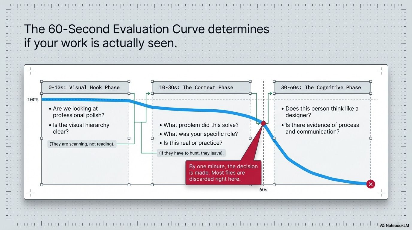
0-10 seconds: Visual first impression
✓ Does this look professional and polished?
✓ Is there clear visual hierarchy?
✓ Can I immediately tell what I’m looking at?
They’re not reading yet. They’re just scanning to see if this is worth their time.
10-30 seconds: Project context
✓ What problem did this solve?
✓ What was your role?
✓ Is this real work or practice?
They need to understand what they’re evaluating quickly. If they have to hunt for this information, they won’t.
30-60 seconds: Deciding whether to invest more time
✓ Does this person think like a designer?
✓ Is there evidence of process and reasoning?
✓ Can they communicate clearly?
By one minute, they’ve decided: keep reading or move on. Most files get discarded here.
What this means for you:
Your first page, your first project, your first impression needs to work in 60 seconds. Everything else is extra. If you don’t hook them immediately, they never see your best work.
Quick break. This matters.
AI won’t replace designers. But it will expose them.
Because when AI can generate anything, wireframes, copy, flows, prototypes, the only thing left that's truly yours is your judgment.
And most designers haven't trained for that.
That's exactly what Edward Cupps is here to challenge at UXCON26.
Edward is a senior UX strategist who has spent years helping teams move beyond deliverables and into decision-making. At UXCON26, he'll break down what it actually means to lead with judgment in an AI-powered world, how to stay relevant, stay valuable, and show up as the designer who shapes outcomes, not just executes them.
This is the conversation the industry has been avoiding. Edward's bringing it to the stage.
Back to organizing your files.
The organization signals that separate juniors from seniors
File organization reveals experience level faster than almost anything else. Here’s what separates different levels:
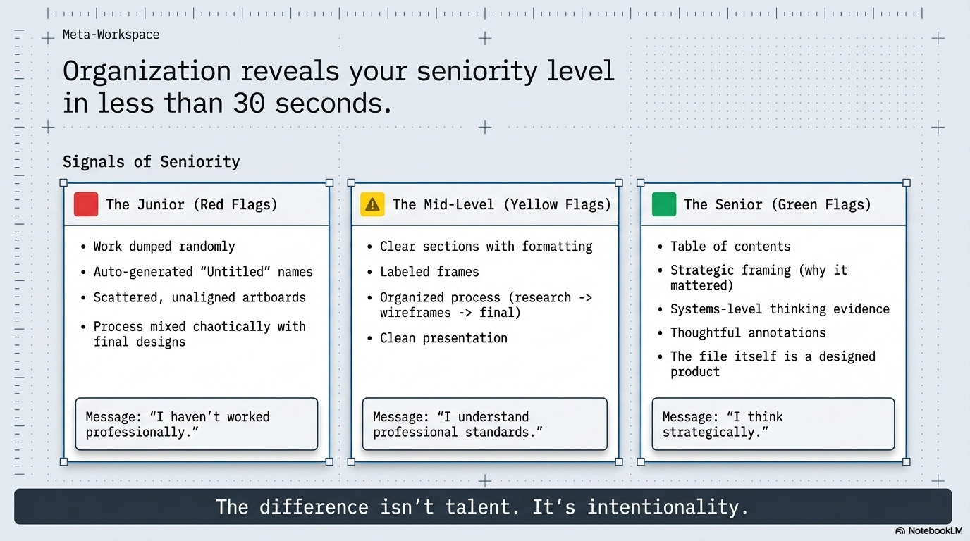
🟥 Junior/student signals:
→ Projects dumped on pages with no structure or order
→ Everything labeled “Untitled” or auto-generated names
→ Artboards scattered randomly with no alignment
→ Process work mixed with final work with no clear separation
→ Inconsistent presentation style across projects
→ No clear narrative or explanation of thinking
What it says: “I haven’t worked professionally yet. I don’t know how to present work for review.”
🟨 Mid-level signals:
→ Clear project sections with consistent formatting
→ Labeled pages and frames that make sense
→ Process shown but organized (research → wireframes → final)
→ Context provided for each project
→ Clean visual presentation
→ Some attention to detail in file organization
What it says: “I’ve worked on teams. I know how to present work. I understand professional standards.”
🟩 Senior signals:
→ Table of contents or clear navigation structure
→ Each project tells a story with clear beginning/middle/end
→ Strategic framing (why this mattered, what changed)
→ Evidence of thinking at systems level, not just screens
→ Thoughtful use of annotations and explanations
→ File feels like it was designed, not just assembled
What it says: “I think strategically. I communicate effectively. I understand what stakeholders need to see.”
The difference isn’t talent. It’s intentionality.
Juniors throw work in a file. Seniors design their portfolio presentation as carefully as they design products. That distinction is visible in the first 30 seconds.
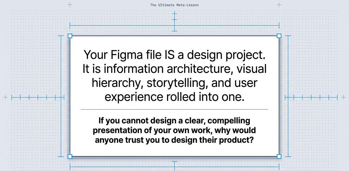
💡 Reality check: Your Figma file IS a design project. Treat it like one.
How to structure case studies people actually want to read
Case studies fail when designers write what they want to say instead of what readers need to know. Here’s a structure that actually works:
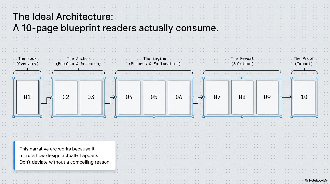
📍 Page 1: Project Overview (the hook)
Answer these questions immediately:
→ Project name + one-sentence description
“Redesigning checkout flow for an e-commerce platform”
→ Your role (be specific)
“Lead designer. I conducted research, designed solutions, and collaborated with 1 PM and 2 developers.”
→ Timeline
“6 weeks, March-April 2024”
→ The core problem
“Users were abandoning cart at 68% rate due to confusing multi-step checkout.”
→ The outcome
“Reduced abandonment to 34% and increased completed purchases by $47K/month.”
Why this works: Everything a hiring manager needs to evaluate the project is visible immediately. They can decide if they want to read more.
📍 Pages 2-3: The Problem & Research
→ Show you understand the user and business context
→ Include key research insights (2-3 max, not everything)
→ Use quotes, data, or observations to make it concrete
→ Keep it visual: photos from research, graphs, user journey maps
Avoid: Walls of text explaining your entire research process. Nobody cares about every interview question. Show the insights that drove design decisions.
📍 Pages 4-6: Process & Exploration
→ Show sketches, wireframes, or early concepts
→ Explain what you tried and why
→ Show iteration based on feedback or testing
→ Make it clear you didn’t just design one thing and call it done
Avoid: Showing 47 variations of the same screen. Curate. Show 2-3 meaningful explorations with clear rationale for each.
📍 Pages 7-9: Solution
→ High-fidelity designs with context
→ Annotations explaining key decisions
→ Interactions or flows if relevant
→ Before/after comparisons if applicable
Avoid: Just dumping screens with no explanation. Every design choice should have visible reasoning.
📍 Page 10: Impact & Reflection
→ What happened after you shipped?
→ Metrics if you have them (be honest if you don’t)
→ What you learned
→ What you’d do differently next time
Avoid: Making up numbers or pretending everything went perfectly. Honesty about limitations builds more credibility than fake perfection.
The pattern:
Problem → Research → Process → Solution → Impact
This narrative arc works because it mirrors how design actually happens. Don’t deviate from it unless you have a very good reason.
The naming conventions that make you look professional
This sounds boring. It is boring. It also separates people who get interviews from people who don’t.
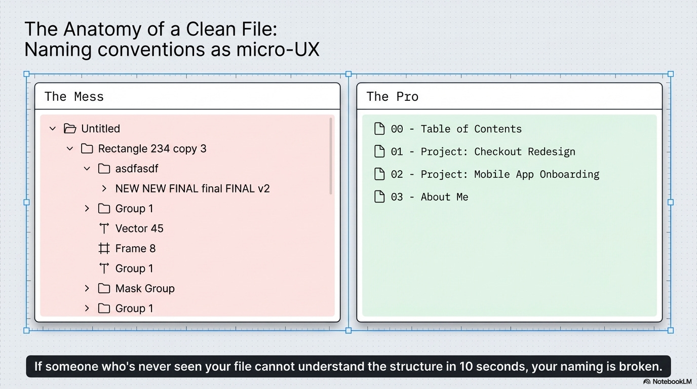
✅ Page naming that makes sense:
→ “00 - Table of Contents”
→ “01 - Project: Checkout Redesign”
→ “02 - Project: Mobile App Onboarding”
→ “03 - About Me”
Why it works: Clear order. Scannable at a glance. Easy to navigate.
✅ Frame naming that shows thinking:
→ “Research Findings - Key Insights”
→ “Wireframes - V2 (after user testing)”
→ “Final Designs - Mobile”
→ “Annotated Flow - Happy Path”
Why it works: The name tells you what you’re looking at and what version/context it represents.
✅ Layer naming that’s actually useful:
→ “CTA Button - Primary”
→ “Navigation - Desktop”
→ “Form Field - Error State”
Why it works: Anyone (including developers) can understand your file structure. Signals you think about handoff and collaboration.
❌ What not to do:
→ “Frame 4738”
→ “Rectangle 234 copy 3”
→ “asdfasdf”
→ “NEW NEW FINAL final FINAL v2”
→ “Untitled” (the default for everything)
Why it fails: Looks sloppy. Signals you don’t care about craft or details.
The rule:
If someone who’s never seen your file before can’t understand what they’re looking at within 10 seconds, your naming is broken. Fix it.
🎯 Take-home: Naming isn’t about being anal-retentive. It’s about respecting other people’s time and showing you think systematically.
📦 Resource Corner
Bestfolios
Curated collection of strong portfolios. Study how the best ones are organized and presented.
Case Study Club
Real case studies with good structure. Notice the narrative flow and information hierarchy.
Cofolios
More portfolio examples with filtering. Look specifically at organization and presentation, not just design quality.
Figma Best Practices
Official Figma guidance on file organization, naming, and structure. Basic but solid.
How to Present Design Work (NN/g)
Research-backed article on communicating design effectively. Applies directly to portfolio presentation.
UX Portfolio Formula
Specific templates and structures for case studies. Good starting point if you’re totally lost.
💭 Final Thought
Messy files don’t just look bad. They reveal how you think, how you work, and how much you care about craft. And hiring managers see that immediately.
Clean it up. Name things properly. Structure your stories clearly. Make it easy for people to see how good you actually are.
Your work might be great. Make sure people can actually see it.

