


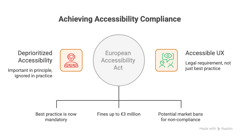
For years, accessibility in UX lived in a familiar place: important in principle, deprioritized in practice. It made it onto roadmaps as a future item. It got flagged in audits and quietly moved to the next sprint. It was the thing everyone agreed mattered and almost nobody made time for.
That era is over.
The European Accessibility Act came into effect June 28, 2025. What was best practice is now a legal requirement. And with fines reaching €3 million and potential market bans for non-compliance, the conversation has moved from “we should do this” to “we have to do this before someone comes looking.”
Most teams are not ready. This issue is about what that means and what to do about it.
In This Issue:
What actually changed and why it matters now
What the law requires in plain terms
Where most UX teams currently stand
What this means for designers specifically
What this means for researchers specifically
How to start without overhauling everything at once
Resource Corner
What Actually Changed And Why It Matters Now
The European Accessibility Act went into effect June 28, 2025, with full compliance required by 2030. Similar laws are progressing in the US through ADA digital updates, and in Australia, Canada, India, and Brazil. Medium
This is not a European problem for European companies. Any product that serves European users falls under its scope. And the direction of travel globally is unmistakable. Digital accessibility is moving from a voluntary standard to a legal obligation across most major markets simultaneously.
Designing accessible experiences is now a legal requirement rather than an option. The shift is significant because the consequences are no longer reputational. They are financial and operational. A product that fails accessibility compliance is now a business risk in a way it was not two years ago. Slickplan
The timing also matters. 53% of UX practitioners expect AI-powered accessibility tools to have a major impact in 2026, suggesting that AI might finally help make accessibility the default rather than an afterthought. The tools are getting better. The legal pressure is getting real. There has never been a better-resourced or more urgent moment to take this seriously. everyday ux
October 8 - where will you be?
Because the best UX professionals in the world already know the answer.
UXCON26 is the one day every year where design teams leave with clarity, new skills, and the kind of connections that actually change careers.
Talks, workshops, and conversations with the people shaping the future of product design. All in one room. One day only.
What The Law Requires In Plain Terms
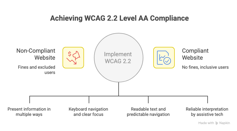
The technical standard underpinning most accessibility legislation is WCAG, the Web Content Accessibility Guidelines. The current version is WCAG 2.2. Most legislation requires at minimum Level AA compliance.
What that means practically:
→ Perceivable: Information must be presentable to users in ways they can perceive. This includes text alternatives for non-text content, captions for video, sufficient color contrast, and content that does not rely solely on color to convey meaning.
→ Operable: Users must be able to operate the interface. Keyboard navigation for all functionality. No content that flashes more than three times per second. Clear focus states that are visible without a mouse.
→ Understandable: Content and interfaces must be understandable. Readable text, predictable navigation, clear error identification and suggestions when users make mistakes in forms.
→ Robust: Content must be robust enough to be reliably interpreted by assistive technologies including screen readers, voice control software, and switch access devices.
Non-compliance means fines up to €3 million and potential market bans. Beyond the financial risk, the more immediate practical reality is that if your product cannot be used by people with disabilities, you are excluding a significant portion of your potential users by design. Medium
Where Most UX Teams Currently Stand
Honest assessment: most teams are behind.
Accessibility audits get deprioritized. Automated testing catches roughly 30% of issues. The rest require manual testing with actual assistive technologies that most teams have never used in a structured way. Designers are often building on component libraries that were never audited for accessibility. Researchers are rarely recruiting participants who use assistive technology.
What used to be considered best practice is now becoming legally required, and many teams are operating without the infrastructure to meet that bar. Smashing Magazine
The gap between where most teams are and where the law requires them to be is real. But it is also closeable. The teams making progress are not the ones trying to fix everything simultaneously. They are the ones who started somewhere specific and built momentum.
What This Means For Designers Specifically
Accessibility is not a final-stage audit. It is a design decision made at every step.
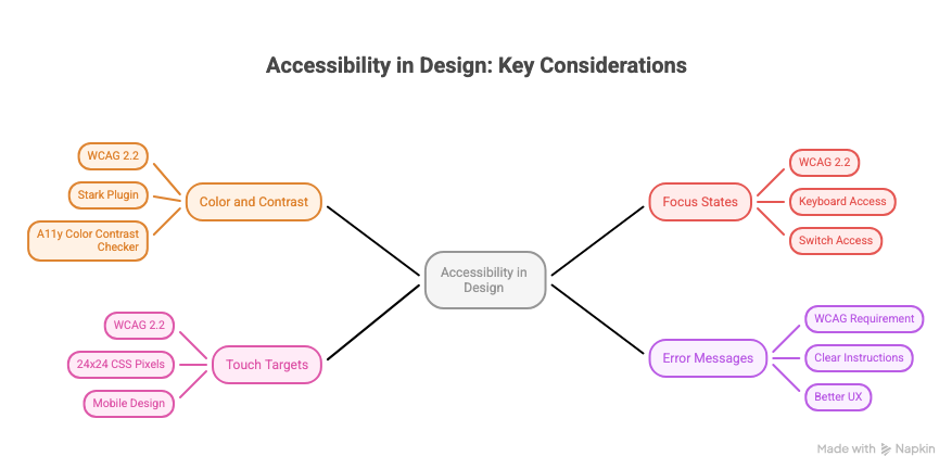
🔵 Color and contrast are not aesthetic choices anymore WCAG 2.2 requires a contrast ratio of at least 4.5:1 for normal text. Designing a color system without checking contrast is designing something that will fail the audit and potentially the law. Figma plugins like Stark and A11y Color Contrast Checker make this checkable in seconds. There is no good reason not to do it from the start.
🔵 Focus states are a design element, not an engineering afterthought Every interactive element needs a visible focus indicator. WCAG 2.2 requires that the focus indicator encloses the focused component or meets minimum size requirements. If your designs do not specify focus states, engineering will either invent them or skip them. Either way you have lost control of a critical part of the experience for keyboard and switch access users. Slickplan
🔵 Touch targets have a minimum size WCAG 2.2 introduced a new success criterion requiring touch targets to be at least 24x24 CSS pixels. Small tap targets are one of the most common and most easily preventable accessibility failures in mobile design.
🔵 Error messages need to tell users what to do, not just what went wrong “Invalid input” is not an accessible error message. “Please enter a phone number in the format 07911 123456” is. The difference is not just better UX. It is a WCAG requirement.
What This Means For Researchers Specifically
Accessibility research is one of the most consistently underdone practices in the field. Most usability testing recruits participants who do not use assistive technology. Most research questions do not include participants with disabilities. This produces a fundamental blind spot in almost every UX team’s understanding of their product.
🔵 Recruit participants who use assistive technology Screen reader users. Voice control users. Switch access users. Keyboard-only navigators. These are not edge cases. They are a significant user population who interact with digital products in ways that reveal failures invisible in standard usability testing. If your research never includes them, your findings are incomplete.
🔵 Accessibility is a research question, not just a design requirement What do users with disabilities actually need from this product? Where do they encounter friction that sighted, able-bodied users do not? What workarounds have they built because the product does not accommodate them? These are researchable questions with answers that should shape product decisions. They rarely get asked.
🔵 Disability disclosure in recruitment needs care Recruiting participants with disabilities requires thoughtfulness about how you ask, how you frame the sessions, and how you accommodate different needs in the research environment. This is not optional sensitivity. It is methodological rigour. Research conducted in ways that exclude or burden participants with disabilities is not accessible research.
How To Start Without Overhauling Everything At Once
The teams making real progress on accessibility are not treating it as a separate workstream that runs alongside everything else. They are embedding it into existing processes.
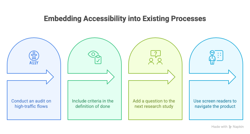
✓ Run an accessibility audit on your highest-traffic flows first Not everything at once. The login flow. The checkout. The primary navigation. The places where the most users encounter the product. Automated tools like axe DevTools and Lighthouse will surface the issues that automated testing can catch. Manual testing with a screen reader will surface the rest. Start with the flows that matter most.
✓ Add accessibility criteria to your definition of done A feature that is not keyboard navigable is not done. A design that has not been checked for color contrast is not ready for handoff. Making accessibility criteria explicit in your team’s definition of ready and done means it stops being an afterthought and starts being a requirement at the point where it is cheapest to fix.
✓ Include one accessibility-related question in your next research study Not a dedicated accessibility study. Just one question, or one task, that reveals something about how your product works for users with different needs. Start building that knowledge base gradually rather than waiting for a large dedicated effort that may never get prioritized.
✓ Get familiar with a screen reader VoiceOver on Mac and iOS. NVDA on Windows. Both are free. Spending one hour navigating your own product with a screen reader will teach you more about its accessibility gaps than any audit document. It is also the fastest way to build genuine empathy for what the experience is like for users who depend on it.
THIS WEEK’S JOB FIND 🔍
Allegis Group is growing their UX Research team and looking for a Senior / Team Lead UX Researcher in Hanover, MD.
If you have experience leading research strategy, shaping discovery, and working closely with Product, Design, Architecture, and Business to influence outcomes, this one’s worth a look.
The role includes: → Leading end-to-end UX research across enterprise-level initiatives → Driving early discovery to help teams make informed decisions before build → Partnering with cross-functional stakeholders to align user needs with business goals → Mentoring researchers and elevating research practices across the org
📦 Resource Corner
WebAIM The most practical, no-jargon resource for understanding accessibility requirements. Their contrast checker and screen reader guides are used daily by practitioners who take this seriously.
Stark Figma plugin that checks color contrast, simulates color blindness, and audits focus order directly in your design files. The fastest way to catch accessibility issues before they reach engineering.
axe DevTools The browser extension used by most accessibility specialists for manual auditing. Free version catches the automated issues. Pair it with manual screen reader testing for a complete picture.
European Accessibility Act Summary The actual legislation, summarized. Worth understanding directly rather than through secondhand summaries if your product serves European users.
Inclusive Design Principles Seven principles for designing for human diversity. More useful as a daily reference than a one-time read. Bookmark it.
Accessibility for UX Researchers (UX Design Institute) Specifically about how to conduct research that includes participants with disabilities. Covers recruitment, session design, and analysis considerations.
💭 Final Thought
Accessibility was always the right thing to do. That argument, on its own, was not moving the needle fast enough for most organizations.
Now there is a different argument available. It is a legal requirement in a growing number of markets. Non-compliance carries real financial consequences. And the population of users who depend on accessible design is large enough that ignoring them was never a good business decision, even before the law got involved.
What is different in 2026 is the focus on infrastructure. Design is less about visible novelty and more about systemic intelligence, making complexity understandable and experiences genuinely usable for everyone. Smashing Magazine
Accessibility is not a constraint on good design. It almost always makes the experience better for everyone. Clearer error messages help all users. Better color contrast is easier to read in sunlight. Keyboard navigation helps power users who never touch a mouse. Designing for the edges improves the center.
The law caught up with what good UX always required. Now there are fewer excuses and more reasons than ever to build it in from the start.

