


Let’s pull back the curtain on what really happens when a hiring manager opens your portfolio.
In the first 3 seconds, they scan your opening case study title and first visual. If it doesn’t immediately signal impact, they’re already mentally moving to the next candidate. In the next several seconds, they’re skimming for metrics, outcomes, and evidence of strategic thinking.
That is the whole window. Hiring managers get 200+ applications for senior roles and spend an average of 6 to 8 seconds on the initial portfolio scan before deciding to dig deeper or move on.
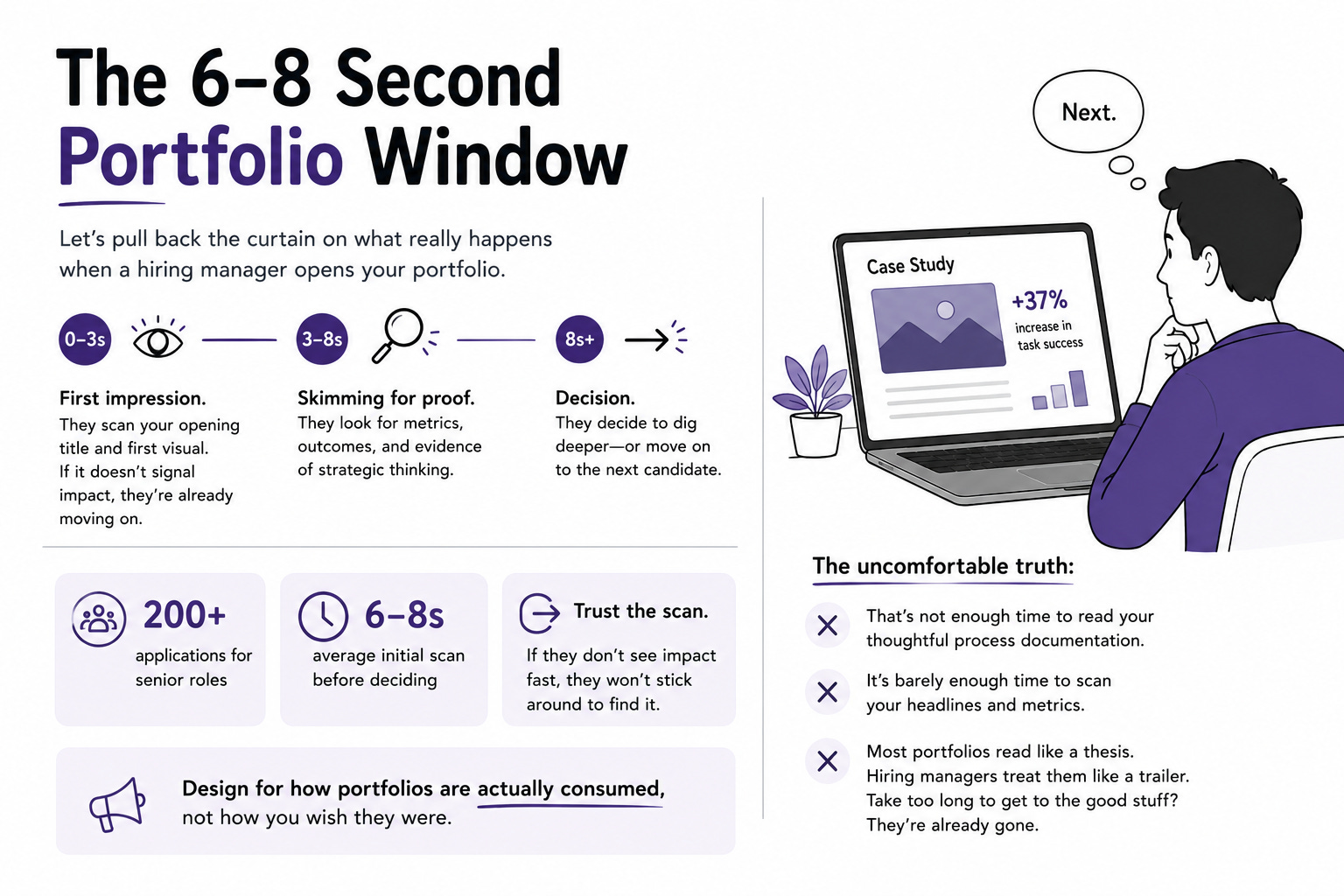
Here is the uncomfortable part: that is not enough time to read your thoughtful process documentation. It is barely enough time to scan your headlines and metrics. Most designers and researchers build their portfolio like a thesis, something to be read start to finish. Hiring managers treat it like a trailer. If yours takes two minutes to get to the good stuff, they are already gone.
This issue is about designing for how portfolios are actually consumed, not how you wish they were.
In This Issue:
The 6-second scan and what it means
Why storytelling beats screenshots (with the data)
The metrics move: from “improved UX” to real numbers
What researchers should show that designers should not
A practical fix list for this week
Resource Corner
The 6-Second Scan And What It Means
The numbers are brutal and worth internalizing.
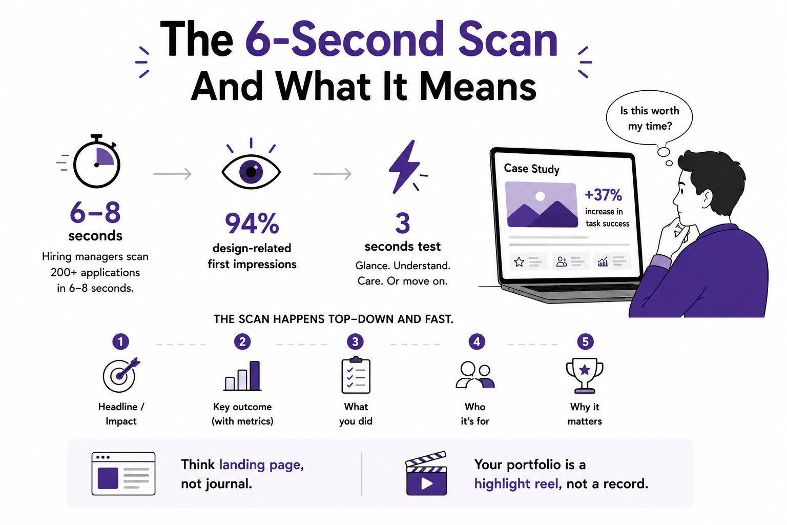
📊 Hiring managers get 200+ applications for senior roles and spend 6 to 8 seconds on the initial scan.
📊 94% of first impressions are design-related, which means your portfolio itself has to demonstrate good UX before anyone reads a word.
📊 Most portfolios fail the “3-second test”: can someone glance at any section and instantly understand what it is and why it matters?
Think of your portfolio like a landing page, not a journal. Nobody watches a 3-minute trailer that takes 2 minutes to get to the good stuff. The reader wants to know immediately: is this worth my time?
The practical implication changes everything about structure. Your most impressive result belongs at the very top, in the title, before the reader has scrolled. Not buried in the results section at the bottom of case study three. The scan happens top-down and fast, and if the top does not hook, the bottom never gets seen.
Your portfolio isn’t a record of your career. It’s a strategic highlight reel for where you’re headed next. Treat every scroll as a pitch.
Why Storytelling Beats Screenshots
Here is the thing that separates portfolios that get callbacks from ones that get crickets, and it is not visual polish.
A hiring manager reviewing dozens of portfolios will remember a strong story over a collection of screenshots. UX is not about aesthetics. It’s about problem-solving. A good story explains why you made key decisions, not just what you did. Companies don’t hire people to make things look nice. They hire them to solve business problems.
The data backs this up clearly. From studying UX hiring, the portfolios that perform best are the ones that explain thinking and demonstrate a user-centric mindset. Not the flashiest. The clearest.
Storytelling makes your portfolio compelling, but documentation is what makes it credible. It gives hiring managers the evidence they need to evaluate your rigor and trust your conclusions. Without it, you could claim your work increased profits 12x, but with no methodology or supporting artifacts, that claim doesn’t hold water.
A good case study has a shape: problem, context, process, solution, results. But the shape alone is not the story. The story lives in the why. Why you chose that method. What went wrong. What constraint forced a hard tradeoff. What changed over time. Adding real constraints, feedback loops, and what changed makes your work feel realistic and job-ready. Perfect projects where everything went smoothly read as fiction. The messy, honest journey reads as experience.
One more discipline: length. The goal is structured storytelling that shows decision-making from start to finish, typically within 500 to 600 words per case study. Detail should serve clarity, not volume. Overloading with raw research and endless screenshots dilutes the narrative that actually gets you hired.
AI can now do in seconds what used to take you a week. So where does that leave you?
Every week there’s a new tool that drafts wireframes, writes copy, generates user flows, even portfolio creation, the things that used to be your job security. And the question quietly sitting underneath all of it is: if AI can produce the deliverable, what exactly am I bringing to the table?
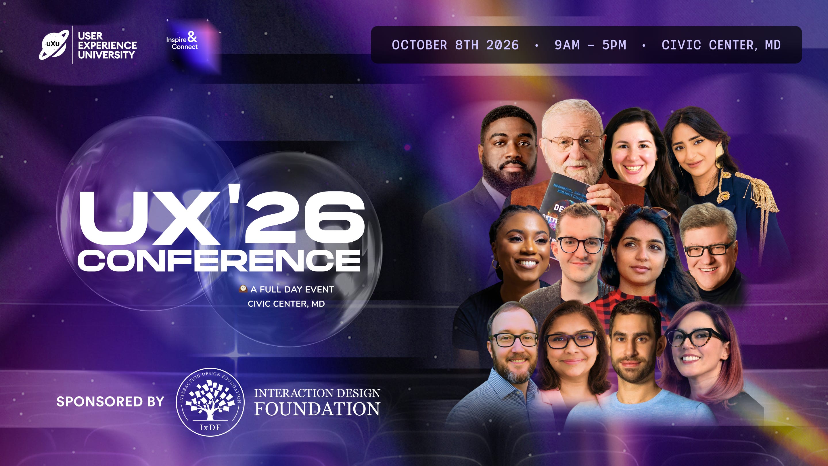
The answer isn’t panic. It’s positioning. UXCON26 brings together practitioners from Netflix, The New York Times, Target, and more who are already working through this exact shift, alongside Don Norman, the person who defined what user experience even means in the first place.
October 8. One day. The conversations that actually answer the question.
The Metrics Move: From “Improved UX” To Real Numbers
This is the single highest-leverage change most people can make.
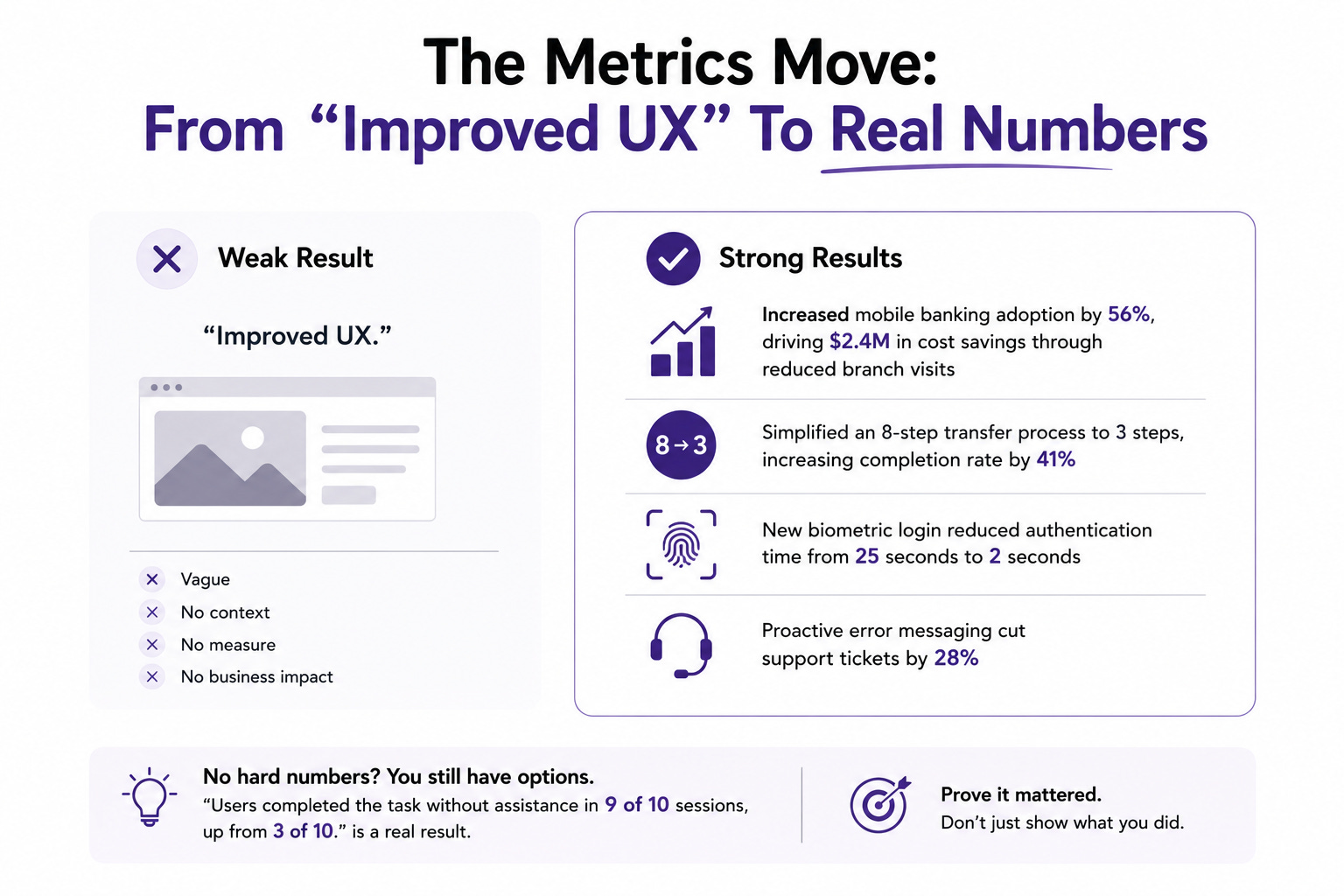
“Improved UX” is about as meaningful as saying “we made it better.” Better how? Better by what measure? Better for whom? Senior practitioners speak in business metrics because that’s the language executives understand.
Look at the difference. Here is what a strong results section actually looks like:
▸ Increased mobile banking adoption by 56%, driving $2.4M in cost savings through reduced branch visits
▸ Simplified an 8-step transfer process to 3 steps, increasing completion rate by 41%
▸ New biometric login reduced authentication time from 25 seconds to 2 seconds
▸ Proactive error messaging cut support tickets by 28%
Notice the structure. The most important result is stated first, giving the reader the key takeaway instantly. Each line connects a design decision to a measurable outcome. This is scannable in the 6 seconds you actually get.
And if you do not have hard numbers? You still have options. Even small-scale projects can demonstrate measurable change: improved usability test success rates, reduced task completion time, clearer information hierarchy. If hard metrics are unavailable, qualitative outcomes and structured feedback can still demonstrate impact. “Users completed the task without assistance in 9 of 10 sessions, up from 3 of 10” is a real result even without a revenue figure attached.
The point is to prove it mattered, not just to show what you did.
What Researchers Should Show That Designers Should Not
This matters, because research portfolios are not design portfolios with different screenshots. They are a different artifact.
UX research portfolios aren’t meant to impress with polished visuals. They’re meant to reveal how you think. While design portfolios highlight the final product, research portfolios should focus on how you informed that product: what questions you asked, how you gathered data, and what decisions your work influenced.
As one Google UX Research Lead put it: your portfolio isn’t a research readout to stakeholders, it’s a self-portrait of you as a researcher. That reframe takes the pressure off making it flashy and puts it where it belongs, on demonstrating rigor and judgment.
For researchers specifically:
▸ Lead with the decision your work influenced, not the methodology. “My research killed a feature the team had already started building” is a stronger opening than “I ran 12 interviews.”
▸ Show your reasoning, not just your methods. Explain why you chose usability testing over a survey. Otherwise it reads like you ticked research off a checklist.
▸ Include the artifacts as evidence, not decoration. Affinity diagrams, personas, and journey maps show process, but insights are more valuable than screenshots of interview scripts. Link the finding to what changed because of it.
▸ Demonstrate influence beyond the project. If you improved how the team does research, standardized a process, made insights more accessible, show that. It signals you think beyond your own work.
A Practical Fix List For This Week
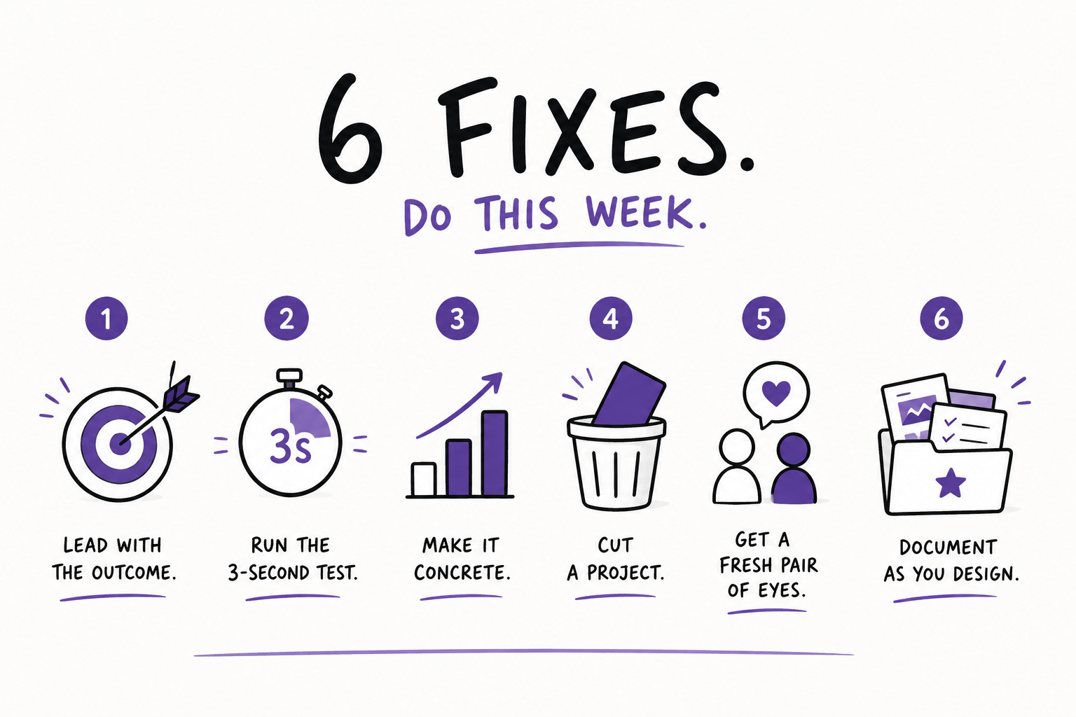
Concrete, in priority order.
✅ Rewrite your top case study title to state your best result. Not “Redesigning the checkout.” Try “Cut checkout abandonment 34% by simplifying an 8-step flow to 3.” Lead with the outcome.
✅ Run the 3-second test on every section. Glance at each one. Can you tell what it is and why it matters instantly? If not, tighten the heading and surface the key point.
✅ Replace every vague claim with a number or a specific qualitative result. Hunt down every “improved,” “enhanced,” and “better.” Make each one concrete.
✅ Cut a project. Digital hoarding kills portfolios. A smaller portfolio with strong storytelling and clear impact beats a large one with shallow explanations. Remove your weakest case study entirely.
✅ Have a non-designer read it. Pick someone who is not in the field. If they cannot understand what you did and why it mattered, it is too dense. This is the fastest reality check available.
✅ Start a “document while you design” habit. Screenshot flows, capture feedback, note decisions as you go. Drop them in a Notion or Figma folder weekly. These breadcrumbs become portfolio gold and save you from reconstructing everything from memory later.
📦 Resource Corner
UX Portfolio Guide: How Senior Designers Get Hired in 2026 (UX Playbook)
The clearest breakdown of the 6-second scan and the 5 things senior portfolios do differently. Directly actionable, honest about what actually moves hiring managers.
UX Research Portfolios That Get You Hired (User Interviews)
21 templates and real UXR portfolios that landed jobs, with strong guidance on storytelling versus documentation. The single best resource specifically for researchers.
How to Write UX/UI Case Studies That Get You Hired (Interaction Design Foundation)
Uses classic story structure (exposition, conflict, climax) to make case studies memorable. Excellent on turning a dry process into a narrative people actually want to read.
Growth.Design Case Studies
Comic-style product teardowns that are a masterclass in visual storytelling and applying psychology. Study the format to learn how to make your own case studies scannable and memorable.
27 Best UX Portfolio Examples (UXfolio)
A current, curated set of real portfolios with analysis of why each works. Useful for seeing the 500-to-600-word case study discipline applied across different career stages.
💭 Final Thought
There is a hard truth buried in all of this, and it is oddly freeing once you accept it.
Your portfolio is not a monument to everything you have done. Nobody has the time or interest to consume it that way. It is a pitch, read in seconds, by someone with 199 other tabs open, who is looking for a reason to say yes or a reason to move on.
That sounds harsh, but it points directly at what to do. Make the yes easy to find. Put your best result where they cannot miss it. Tell the story of how you think, because how you think is what they are actually hiring. Prove it mattered with a number or a concrete outcome. And cut everything that does not serve that.
If your portfolio isn’t landing interviews, it’s usually not because you’re not talented. It’s because it isn’t making the right impression in the window you actually get. Shift from showing what you did to proving why it mattered.
The people who tell the clearest story about their impact are the ones who get hired. Not the ones with the most projects or the prettiest screens.
Open your portfolio. Read only the first 6 seconds of it. Fix what those 6 seconds say.


