

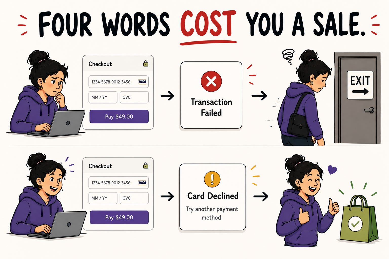
A user gets to your checkout. Their card gets declined. The screen says: “Error. Transaction failed.”
They try again. Same message. They have no idea why. Was it their card? Your site? A typo? They give up and leave. You just lost a sale, not because your product was broken, but because four words failed to tell someone what to do next.
That is the power of microcopy. The tiny, functional text that lives on buttons, in error messages, in form labels, in empty states, in the half-second a user is deciding whether to trust you or leave. It is the most overlooked skill in UX and one of the highest-leverage things any practitioner can get good at.
This issue is a hands-on guide. What microcopy actually is, why it matters more than its size suggests, and specific, practiceable techniques you can apply to your own product this week.
In This Issue:
Why four words can make or break a flow
The numbers that prove microcopy is not a nice-to-have
The three rules that fix most bad microcopy
A practical framework for error messages
Why this is one of the safest skills to invest in right now
Resource Corner
but first…..
Happy 4th of July from UXU. Here’s a little something.
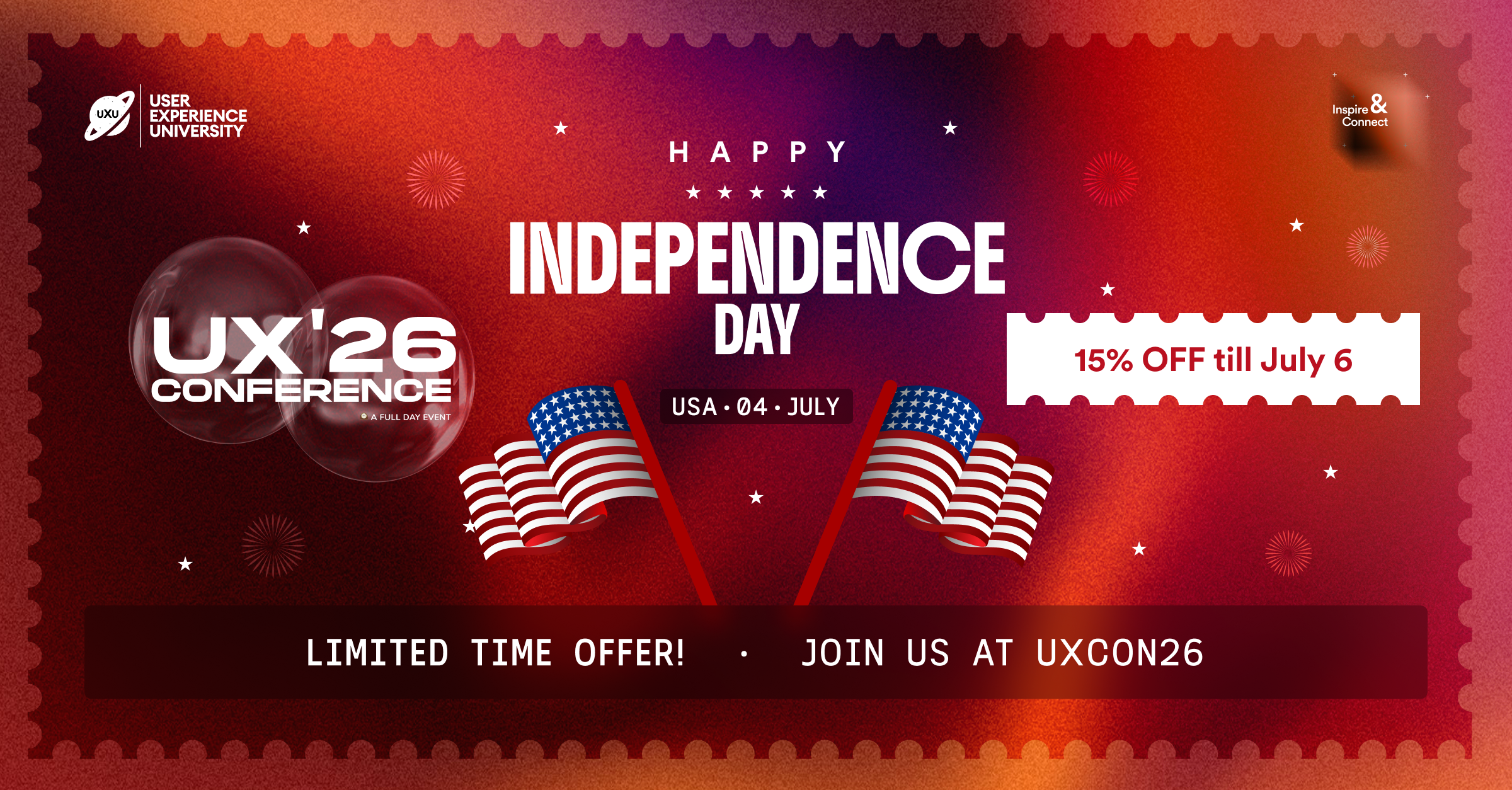
Independence Day feels like the right moment to celebrate the people who chose a field built entirely around making things better for other humans. That is not a small thing. That is the whole point.
This weekend we are marking the holiday with a special discount on UXCON26 tickets, available from Friday July 4 through Monday July 6 only. Four days to lock in the best price this ticket will be before we head into the final stretch toward October 8.
Don Norman headlines a lineup that includes practitioners from Netflix, The New York Times, Target, UserTesting, and Skylight. Three keynotes. Two panels. Workshops. One day built around the conversations this community has been waiting to have out loud.
The offer closes Monday at midnight.
Why Four Words Can Make Or Break A Flow
Microcopy works in the exact moments where users are most likely to abandon. The error. The hesitation. The point of commitment. The empty screen where they do not know what to do.
Tiny words remove roadblocks. Microcopy serves as a guide when users take specific actions and builds trust and empathy. Effective microcopy is clear, concise, fits the visual style, and fills a need. Without it, people hesitate, make mistakes, or abandon tasks. Designlab
The reason it punches so far above its weight is timing. A landing page headline reaches someone who is browsing. Microcopy reaches someone who is acting, at the precise moment the action might fail. A confused user at a button is one bad sentence away from leaving and one good sentence away from completing the task.
Conversion copywriting does not solely deal with words. It is deeply intertwined with UX and how those words are displayed. You must connect the copy to the design work, otherwise the disciplines pull in different directions. Site Builder Report
This is why microcopy is a UX skill, not a marketing one. It is not about persuasion. It is about removing the friction in the exact spot where friction is most expensive.
The Numbers That Prove Microcopy Is Not A Nice-To-Have
Skeptical that text this small moves real metrics? The data is unusually strong.
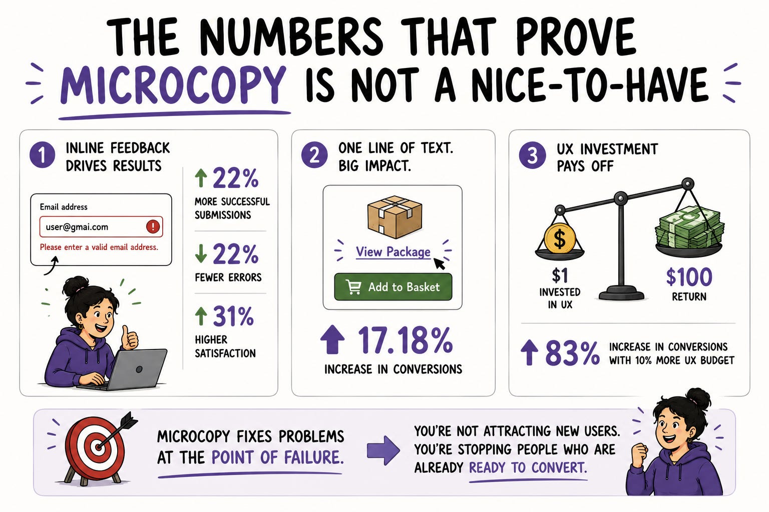
📊 Luke Wroblewski’s study on inline validation found that showing immediate feedback in forms led to 22% more successful submissions, 22% fewer errors, and 31% higher satisfaction. That is from microcopy attached to form fields. Small text, large outcome. Designlab
📊 One documented case showed that adding a “View Package” link above an “Add to Basket” button led to a 17.18% increase in conversions. A single line of well-placed text. Designlab
📊 Industry data finds that every dollar invested in UX yields a return of $100, and increasing the UX budget by 10% can lead to an 83% increase in conversions. Microcopy is one of the cheapest UX interventions available and one of the highest returning. Designlab
The reason these numbers are so strong is that microcopy fixes problems at the point of failure. You are not trying to attract someone new. You are stopping someone who already wanted to complete the task from giving up at the last moment. That is the cheapest conversion you will ever earn.
The Three Rules That Fix Most Bad Microcopy
Most bad microcopy fails the same handful of ways. Fix these three and you fix the majority of it.
✅ Rule 1: Clear beats clever
Keep explanations short and simple to minimize misinterpretation. Use as few words as you can, but enough to clarify what you mean. Personality has its place, but never at the cost of clarity. A funny error message that does not tell the user what went wrong is worse than a plain one that does. When in doubt, choose the version that gets the person unstuck fastest. Site Builder Report
✅ Rule 2: Tell people what to do, not just what happened
This is the single most common microcopy failure. “Invalid input” describes a problem. “Enter your date of birth as MM/DD/YYYY” solves it. Every error, every empty state, every dead end should answer the user’s real question, which is always some version of “okay, so what do I do now?”
✅ Rule 3: Reduce anxiety at the moment of commitment
The points where users commit are the points where they hesitate. On a subscription signup, microcopy like “You’ll be billed on the 1st of every month” and “Change or cancel anytime” helps people understand exactly what they are committing to. A small reassurance at the moment of doubt removes the friction that kills conversions. Tell people what happens next before they have to wonder about it. Lovable
A Practical Framework For Error Messages
Error messages are where microcopy matters most and where it most often fails. Research from Baymard found that the content of the error message itself greatly impacts the user’s ability to quickly recover and get back on track. Site Builder Report
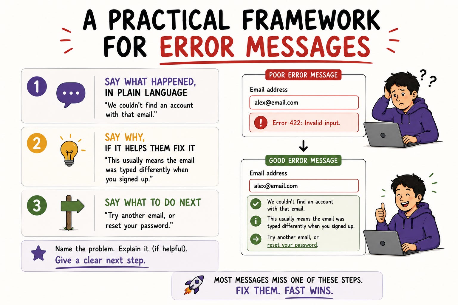
Here is a reliable structure. A good error message does three things in order:
→ Say what happened, in plain language
Not “Error 422.” Not “Invalid input.” Say the actual thing: “We couldn’t find an account with that email.”
→ Say why, if it helps them fix it
“This usually means the email was typed differently when you signed up.” Only include this if it actually helps. If it does not, skip it.
→ Say what to do next
The most important part and the one most often missing. “Try another email, or reset your password.” Always give the user a path forward.
Run your own product’s error messages through this. For a checkout page where a customer enters the wrong shipping address, a message like “We couldn’t verify that address. Check the postcode and try again” works because it names the problem and gives a next step. Most error messages in most products fail at least one of these three steps. Fixing them is some of the fastest, cheapest UX improvement available. Site Builder Report
Why This Is One Of The Safest Skills To Invest In Right Now
In a moment where AI is automating large parts of UX production, microcopy is worth understanding clearly.
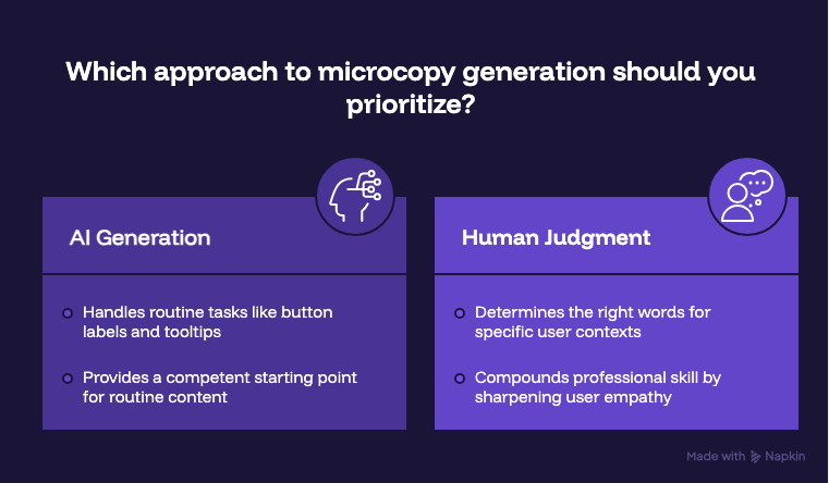
AI does help here. AI now handles the first draft of routine microcopy like button labels, error messages, and tooltips. But first draft is the key phrase. AI can generate a competent error message. It cannot know that your specific users are anxious first-time buyers who need extra reassurance, or that your brand voice is warm rather than corporate, or that this particular error happens most often to people who are already frustrated. Case Study Club
A brilliant product with confusing microcopy dies in onboarding. A simple product with clear, human words thrives. Case Study Club
The judgment about what the right words are for this user, in this moment, in this product’s voice, remains human. AI gives you a draft. Knowing whether the draft is right for your actual users is the skill. And it is a skill that compounds, because it sharpens your sense of the user’s emotional state at every point in a flow, which makes you better at the rest of UX too.
For content designers and UX writers specifically, this is your moment to go deep on the part of the work AI cannot do. For designers and researchers, microcopy fluency makes everything you produce sharper. It is one of the few skills with no real downside to investing in.
📦 Resource Corner
Microcopy: The Complete Guide by Kinneret Yifrah
The definitive book on the subject. Practical, example-driven, and the single best resource for going from “I write okay microcopy” to “I write microcopy that measurably improves products.” Worth every page.
Writing Microcopy: A 2026 Guide for Ecommerce UX (Shopify)
Specific, current, and full of real examples across checkout, forms, and error states. One of the most practical free resources available for applying microcopy to real flows.
The Definitive Guide to UX Writing 2026
Strong on how AI is changing the discipline and where human judgment stays essential. Useful for understanding where to position yourself if you want to specialize.
Nicely Said by Nicole Fenton and Kate Kiefer Lee
A foundational book on writing for digital products with clarity and humanity. Broader than microcopy but directly relevant, and a genuinely enjoyable read.
UX Content Collective
Courses, community, and ongoing resources specifically for content design and UX writing. The best place to go deep if microcopy turns out to be the part of this work you want to build a specialization around.
💭 Final Thought
It is easy to dismiss microcopy because it is small. A few words on a button. A line under a form field. A sentence on an error screen. How much could it possibly matter?
More than almost anything else you will touch, because it operates at the exact moments where users decide whether to continue or quit. The headline gets someone interested. The microcopy gets them through. And no amount of beautiful visual design rescues a flow where the words at the critical moment leave someone confused and stuck.
The best part is that this is immediately practiceable. You do not need a new tool or a course or permission. Open your own product right now. Find one error message that describes a problem without offering a solution. Rewrite it to tell the user what to do next.
That one change, repeated across a product, is the kind of work that quietly lifts conversion, reduces support tickets, and makes the whole experience feel like someone was actually thinking about the person on the other side.
Because someone was. That someone is you.
