


For the last few years, the AI conversation was about capability. Can it do the thing? Is it smart enough? Fast enough? Accurate enough? The race was to make the models more powerful.
That race is quietly being won, and it is revealing the next problem, which is bigger and more interesting for anyone in UX.
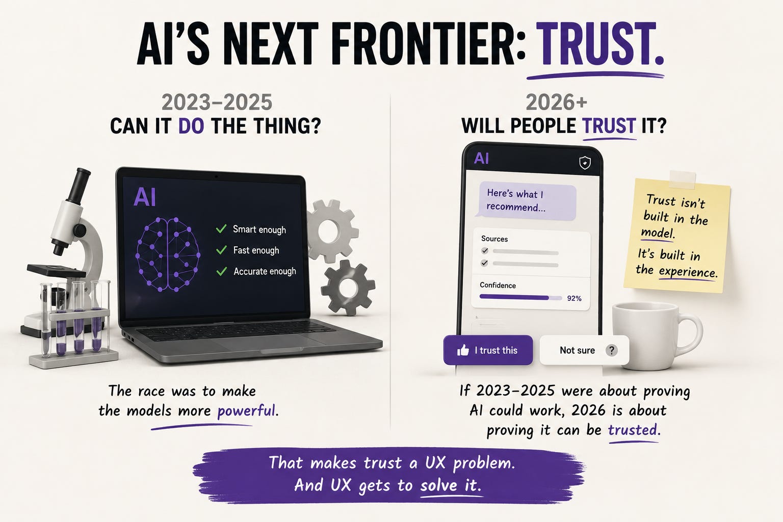
A system can be brilliant and still go unused if people do not trust it. And trust is not built in the model. It is built in the interface, in the moments where a person decides whether to rely on what the AI just told them or quietly abandon it. As one industry analysis put it, if 2023 to 2025 were about proving AI could work, 2026 is about proving it can be trusted. That makes trust a UX problem, and it puts this field in charge of one of the most consequential questions in tech right now.
In this issue:
Why intelligence stopped being the bottleneck
The black box problem and why users are done with it
What explainable design actually looks like
The transparency paradox nobody warns you about
Control as the foundation of trust
Resource Corner
but first…..
UXCON26 Tech Happy Hour - Free to Attend

Thursday, August 20 | 6:00–9:00 PM EDT
The Urban Winery of Silver Spring, MD
Take a night off from the job search, the client hunt, and the portfolio grind. Join us for a relaxed evening of drinks, conversation, and real connection with the people shaping UX, product, design, and tech across the DMV.
Why show up:
✺ Meet practitioners, hiring managers, and collaborators in one room
✺ Walk away with real leads, referrals, and new contacts
✺ Enter to win one of two free UXCON26 tickets
✺ Unlock an exclusive in-person discount on UXCON26, available only at this event
Come for happy hour. Leave with a fuller network
Why intelligence stopped being the bottleneck
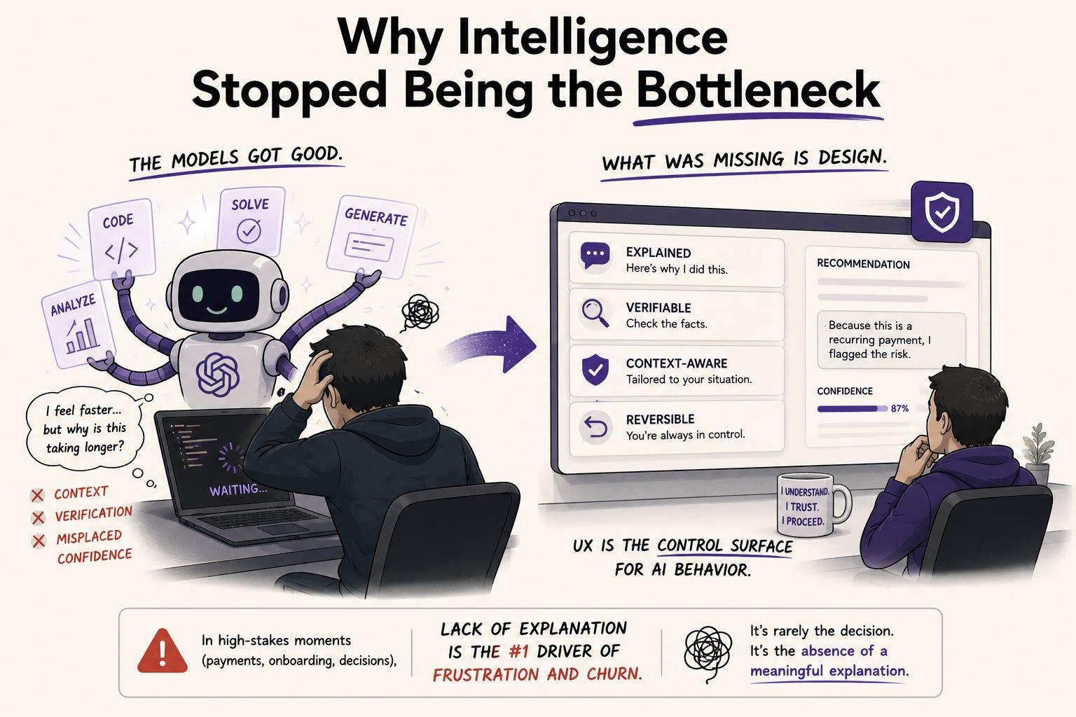
There is a striking finding worth sitting with. Research shows that experienced developers using AI coding tools actually slow down, even while they believe they are moving faster. The problem is not the intelligence or capability of the tools. It is context, verification, and misplaced confidence.
That gap, between how capable a system is and whether people can actually rely on it, is the whole story of AI UX in 2026. The models got good. What did not automatically come with them is the design that lets a person understand, question, and trust what the system is doing.
The framing that is taking hold across the field is that UX has become the control surface for AI behavior. Tone-aware interfaces, failsafe patterns, and explainable actions position UX, not engineering, as the discipline that governs whether AI can be used safely and confidently. This is a genuine expansion of what UX is responsible for. The interface is no longer just how a person operates a tool. It is how they decide whether to believe it.
And the stakes are concrete. Research across financial services consistently shows that a lack of explanation in critical moments is one of the strongest drivers of user frustration and churn, especially in high-stakes scenarios like payments or onboarding. The issue is rarely the decision the AI made. It is the absence of a meaningful explanation for it.
Quick pause. This belongs in the room.
🎯 UXCON26 · One Day · The Whole Community

Questions like this one, what it actually takes to make AI trustworthy through design, are exactly the conversations the field needs to have out loud, together.
On October 8, 2026, the UX community comes together for a full day built around where this work is really heading. Headlining is Don Norman, the person who coined the term user experience, at 88 still publishing and still pushing this field to be braver than it is comfortable being. Alongside him are practitioners from Netflix, The New York Times, Target, UserTesting, and Skylight, hosted by Jeremy Miller of the Beyond UX Design podcast.
The conversations that stay with you long after the day ends. You wouldn’t want to miss this.
The black box problem and why users are done with it
For years, AI systems operated as black boxes. Something went in, an answer came out, and the reasoning in between was invisible. Users were expected to simply accept the output.
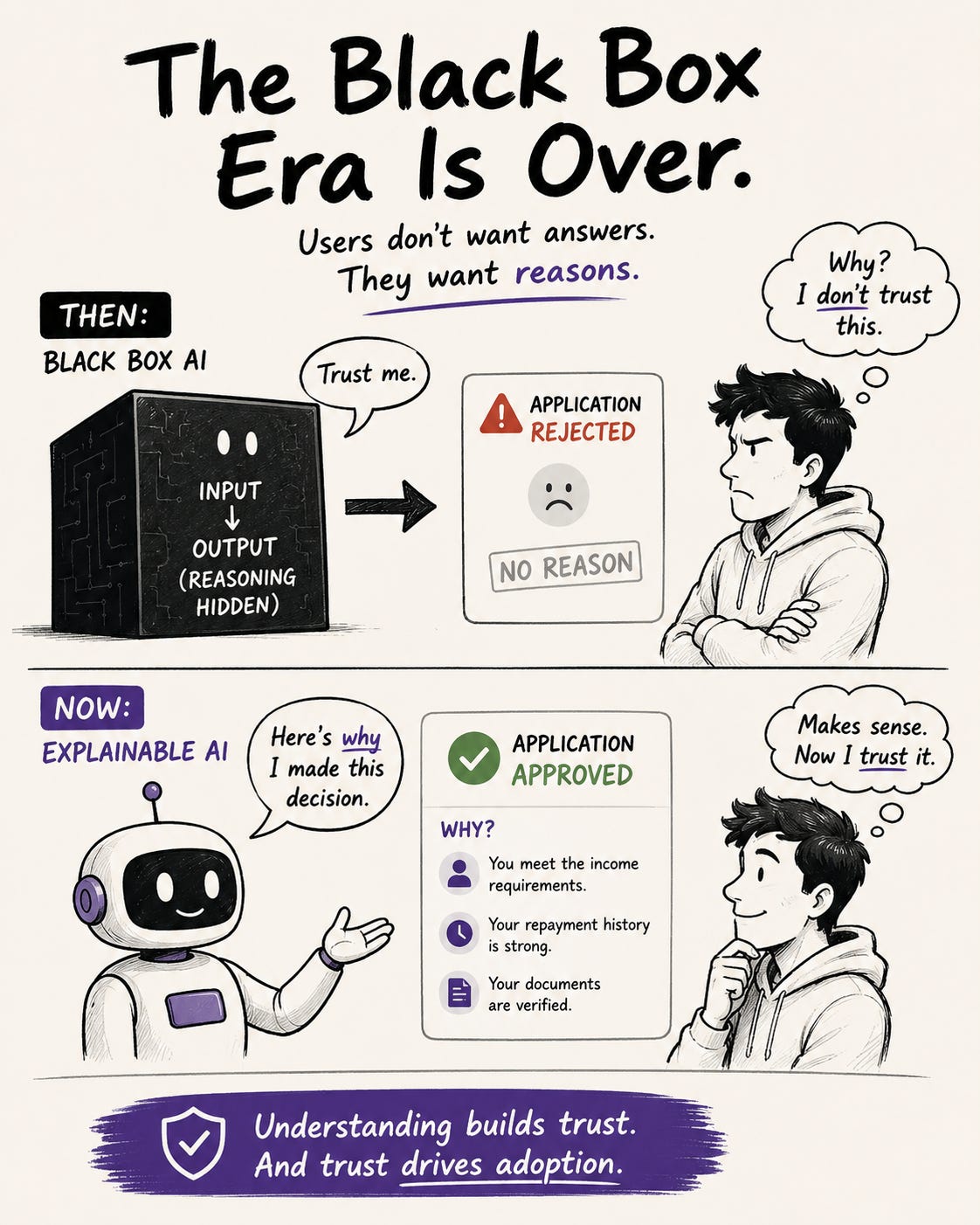
That era is ending, and users are the ones ending it. People in 2026 increasingly demand to know why an AI made a decision on their behalf. The opaque black box is no longer acceptable, and the reason is simple: trust comes through understanding. You cannot trust what you cannot understand, and you will not rely on a system that makes consequential decisions without telling you why.
This is intuitive if you think about your own behavior. An AI recommends a product, flags a transaction as fraud, rejects an application, or reorders your interface, and your immediate reaction is a question: why? When the system answers that question well, trust builds. When it stays silent, suspicion grows, and suspicion is what makes people abandon a product or switch to a competitor.
There is a defensive benefit too. Clear explanation is a weapon against misinformation and against the quiet erosion of confidence that happens when a system feels arbitrary. A person who understands why they are seeing something is far less likely to feel manipulated by it.
What explainable design actually looks like
Here is the good news: explainability does not require exposing model architecture or probability scores. Users do not need any of that. They need a clear, human answer to a simple question.
Often, a single sentence is enough. “We suggest this because you liked that” can defuse mistrust entirely. The pattern is straightforward: connect the output to a cause the user can recognize. Show the reasoning in plain language, at the moment it matters, without drowning them in detail.
A few patterns that are emerging as standards:

🔵 The “why am I seeing this” layer. A small, accessible explanation attached to any AI-driven decision or recommendation. Not a wall of text. One clear reason, available when the user wants it.
🔵 Mutual verification. Before executing something consequential, a simple “Did I get that right?” confirmation. This turns a one-way command into a conversation and gives the user a moment of control before the system acts.
🔵 Confidence signaling. Showing when the system is certain and when it is guessing. A system that admits uncertainty is trusted more than one that states everything with equal, unearned confidence. Sounding sure when you are not is exactly how trust breaks.
🔵 Traceable reasoning. For higher-stakes decisions, showing the cause-and-effect chain: what inputs led to this output. When users can see that reasoning, trust increases significantly. This does not mean technical depth. It means a legible path from input to result.
The guiding principle across all of these, and one worth writing on a wall: do not simplify complexity. Make complexity understandable. Those are different jobs. Hiding complexity leaves users in the dark. Making it understandable respects both their intelligence and their need to trust the system.
The transparency paradox nobody warns you about
Here is where it gets genuinely hard, and where good UX judgment separates from box-checking.
Regulation increasingly requires transparency, and the well-meaning response is to add more of it. Everywhere. Cookie banners, data-processing permissions, AI disclosures, consent toggles, terms and conditions. Each element is individually compliant. Together, they create cognitive overload.
The result is the opposite of what transparency was supposed to achieve. Users get pushed through dense screens of legal language and endless toggles, and instead of informed consent, you get mechanical behavior: scroll, accept, continue. Nobody read anything. Nobody understood anything. The transparency was technically present and functionally useless.
This is the paradox. More transparency does not equal more trust. Piling on disclosures produces the same glazed-over dismissal as hiding everything did. The interface has to simultaneously reduce friction and increase genuine accountability, which is one of the hardest design problems in the field right now.
The way through is not more explanation. It is better-placed explanation. Answer the specific question the user has, at the specific moment they have it, in language they actually process. A single clear explanation at the point of a real decision beats ten dense disclosure screens nobody reads. This is UX craft applied to trust: knowing what to surface, when, and how much, so understanding actually happens instead of just being technically offered.
Control as the foundation of trust
Explanation answers “why did it do that.” Control answers “what can I do about it.” Both are required, and control is the one teams most often forget.
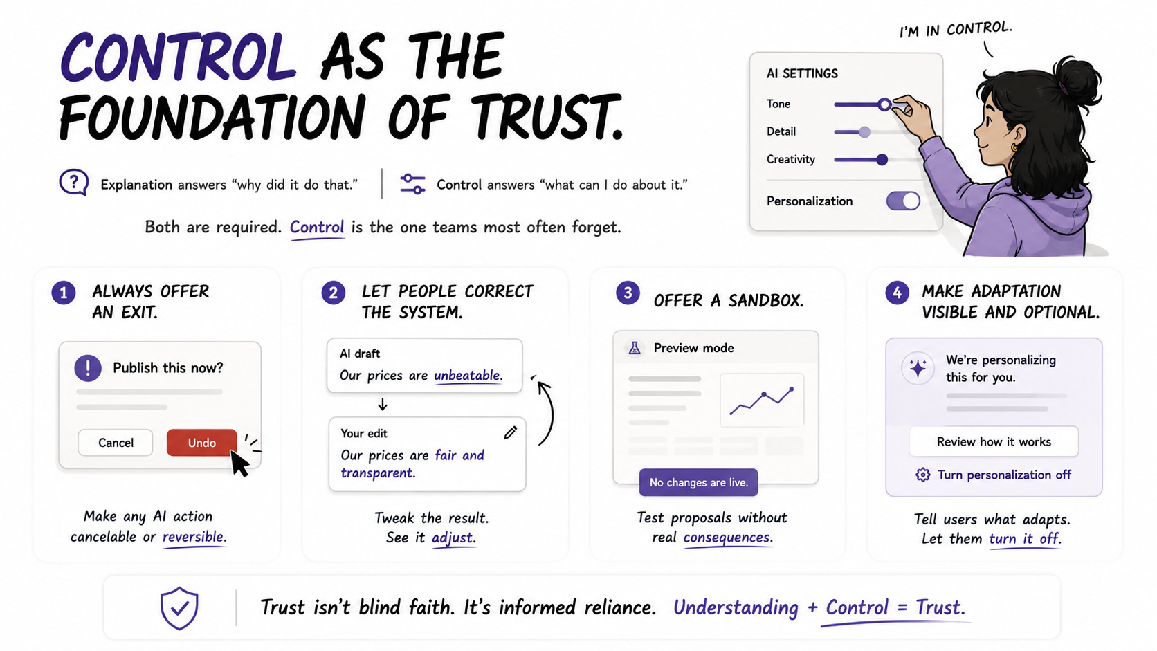
People trust systems they can steer. The design principles emerging around this are concrete:
▸ Always offer an exit. Any AI action should be cancelable or reversible. A person who knows they can undo something engages far more freely than one who fears an irreversible mistake.
▸ Let people correct the system. A way to tweak an AI result and see how it adjusts turns a frustrating black box into a collaborator. The frustration users report most often is systems that respond but do not seem to listen.
▸ Offer a sandbox. Letting people test an AI’s proposal without real consequences builds confidence before commitment. They learn what the system does in a space where being wrong costs nothing.
▸ Make adaptation visible and optional. When a system personalizes or adapts, tell the user it is happening and let them turn it off. “This adapts based on your activity, and here is how to change it” is the difference between helpful and unsettling.
The through-line is agency. Trust is not blind faith in the system. It is informed reliance, the confidence that comes from understanding what the system does and knowing you remain in control of it. That combination, understanding plus control, is what UX is now responsible for delivering.
📦 Resource Corner
Explainable AI UI Design (XAI) (Eleken)
The clearest practical guide on why explainability is a UX problem, not just a technical one, with emerging design patterns and real examples. Start here if this topic is new to you.
Designing Trust in AI Products (Standard Beagle)
Strong on the three levels of transparency, algorithmic, interaction, and social, and how each contributes to what users perceive as honesty. Grounded in real product work.
UX for AI Compliance and Regulatory UX (Markswebb)
The best resource on the transparency paradox, how to explain AI decisions and gather consent without overwhelming users. Essential if you work on anything regulated.
Trust Is the New Benchmark for AI (CMSWire)
A sharp overview of why UX, not IT, is becoming the discipline that governs safe AI autonomy. Good for understanding the strategic shift and where UX gains influence.
People + AI Guidebook (Google PAIR)
The foundational, free resource on designing human-centered AI. Deep, practical guidance on explainability, trust, and feedback that remains one of the best references in the field.
💭 Final Thought
There is something worth appreciating in this shift. For years, UX had to argue for its own relevance in the AI conversation, often reduced to making the model’s output look nice after the important decisions were made elsewhere.
That has flipped. Trust is now the deciding factor in whether AI products succeed, and trust is built almost entirely through the things UX has always been about: understanding what a person needs, anticipating their questions, respecting their agency, and making the complex feel clear. The most powerful model in the world fails if people do not trust it enough to rely on it, and whether they trust it is a design outcome.
That is a real responsibility, and it is a genuine opportunity. The practitioners who learn to design for trust, explanation that lands, transparency that does not overwhelm, and control that feels real, are going to be central to how AI actually gets adopted, not decorative to it.
The question users are asking is “why should I trust this?”
Answering it well is the job now. And it has always been exactly the kind of thing UX does best.


