


Here is a scenario every practitioner has lived.
You spent six weeks on a redesign. The flows were clean. The hierarchy was solid. The stakeholders nodded. You shipped it. And then… users still dropped off at the same point.
You have been there. Every UX practitioner with more than six months on the job has been there. And here is what was probably missing: behavioral psychology. Users don’t make decisions logically, they make them emotionally and instinctively. Design for the screen and you optimize pixels. Design for how people actually decide and you influence outcomes.
The best part? Most UX practitioners are already applying behavioural psychology. They just don’t know the names for it. And naming them matters, because labelling gives you the language to defend your decisions, educate stakeholders, and go deeper.
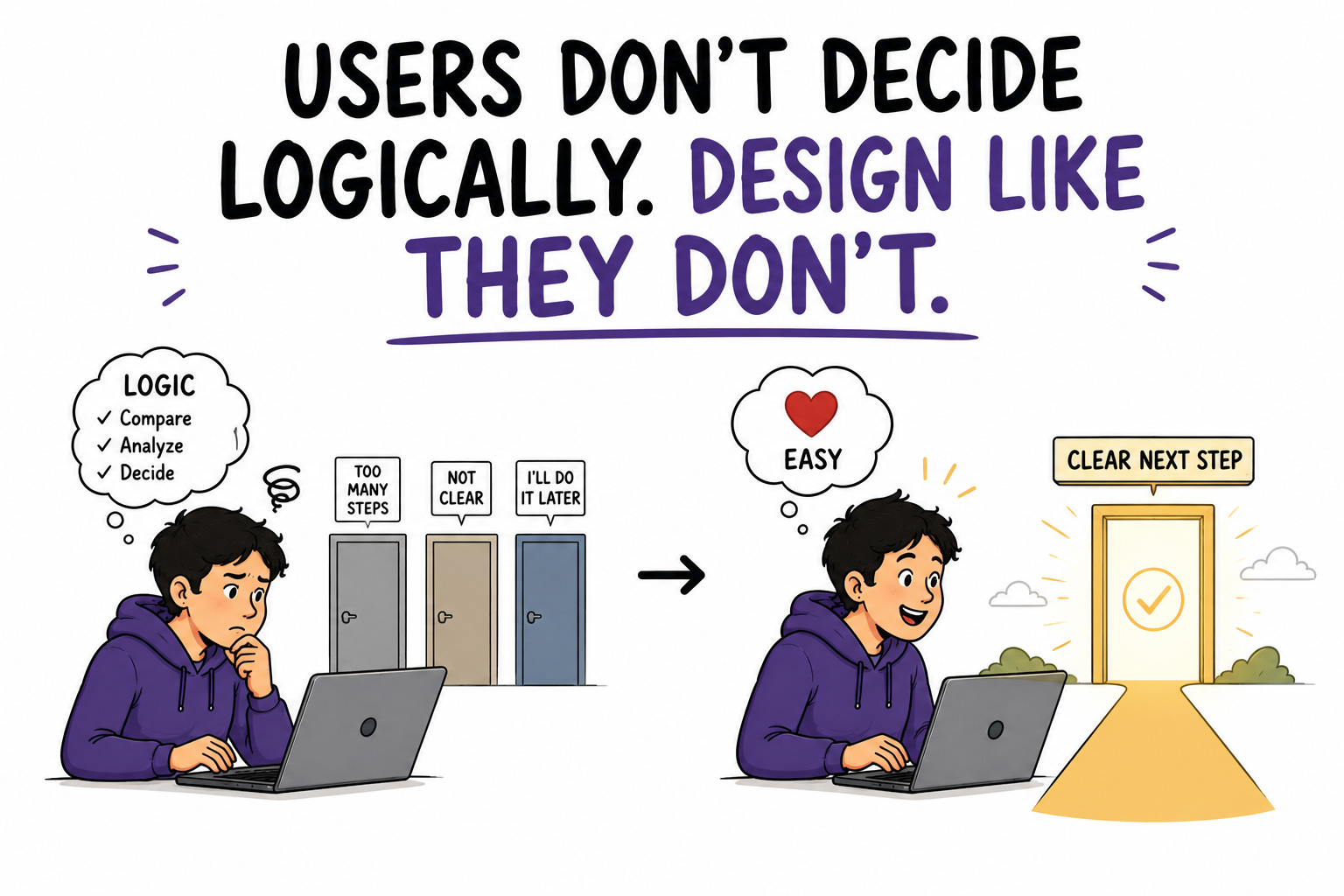
This issue names the principles, backs each with data, and gives you a way to apply every one.
In This Issue:
Why the brain takes shortcuts (and why that is good news)
🧠 6 principles worth knowing by name
The data that proves they move real metrics
The ethical line you do not cross
A practical audit for your own product
Resource Corner
INDEPENDENCE DAY OFFER
This weekend we have been thinking about that a lot in relation to this community. Because what we see every day in the UX space is practitioners who know things need to change, who feel the shift happening around them, who are ready to invest in what comes next. And then the moment passes.
The UXCON26 Independence Day discount closes tonight at midnight. It has been live since Friday and this is the last time we will mention it.

October 8 is the day this community comes together. Don Norman, the person who gave this field its name, headlines a lineup of practitioners from Netflix, The New York Times, Target, UserTesting, and Skylight. People doing work that matters at the highest level, in a room built for honest conversation about where UX is actually going.
The lowest price this ticket will be, ending tonight.
Why The Brain Takes Shortcuts
Start here, because it reframes everything.
The human brain is designed to take mental shortcuts. We don’t analyze every decision in a purely rational manner. Instead, we use heuristics to simplify decision-making. These shortcuts are not flaws. They are how a limited-capacity brain navigates an overwhelming world efficiently.
For practitioners, this is genuinely good news. It means human behavior, while it feels unpredictable, actually follows well-documented patterns. As idiosyncratic as individuals are, the way people process information, remember tasks, and make decisions follows consistent, researchable rules.
Which means you can design for them. Not by manipulating people, but by aligning your interface with how their minds already work. When you design with the grain of human cognition instead of against it, tasks feel effortless. When you design against it, everything feels like friction, no matter how clean the visuals.
🧠 6 Principles Worth Knowing By Name
Each of these has a name, a mechanism, and a direct application. Learn the names. They are how you turn instinct into a defensible design decision.
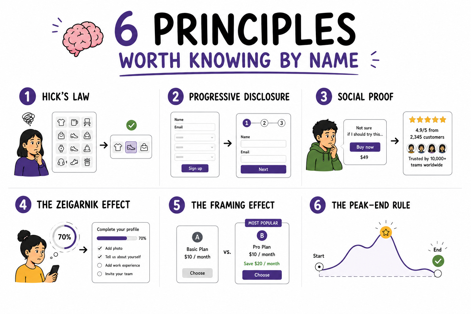
1️⃣ Hick’s Law → fewer choices, faster decisions
The more options a user sees, the longer every decision takes, until they make no decision at all. When you overwhelm users with information, they don’t make better decisions. They make no decision, or they leave.
▸ Apply it: Limit choices per screen. Group related items. Use smart defaults. Offer templates instead of blank starts.
2️⃣ Progressive Disclosure → reveal complexity gradually
Give users exactly what they need at this step, nothing more. The rest can come later, when it’s relevant.
▸ Apply it: That 10-field signup form you’re debating? Break it into steps with context at each one. Show advanced options only when the user reaches for them.
3️⃣ Social Proof → people follow other people
People decide how to behave by relying on what others have done. It is one of the most powerful trust signals available.
▸ Apply it: Surface real user reviews, testimonials, usage numbers, and endorsements at the moment of hesitation. Incorporating reviews and social shares has proven effective at establishing trust and engagement.
4️⃣ The Zeigarnik Effect → we remember what’s unfinished
Humans dislike leaving things incomplete. Incomplete tasks create a low-level mental tension that pulls people back to finish them.
▸ Apply it: Progress bars during onboarding. Checklists showing remaining steps. “Your profile is 70% complete.” The unfinished bar nags in a way that drives completion.
5️⃣ The Framing Effect → how you say it changes the choice
The same information presented differently produces different decisions. Frame shapes perception before logic gets involved.
▸ Apply it: Frame benefits as solutions to pain points (”Spend less time on X”). Present pricing around savings or added value. Use visual cues to emphasize the option you want chosen.
6️⃣ The Peak-End Rule → people remember the peak and the ending
Experiences are remembered based on their most intense moment and how they end, not the average of the whole thing.
▸ Apply it: Build one genuinely delightful moment into a key interaction. End onboarding on a celebratory high with a clear next step. The last impression disproportionately shapes the memory.
The Data That Proves They Move Real Metrics
These are not soft ideas. The numbers behind them are strong.
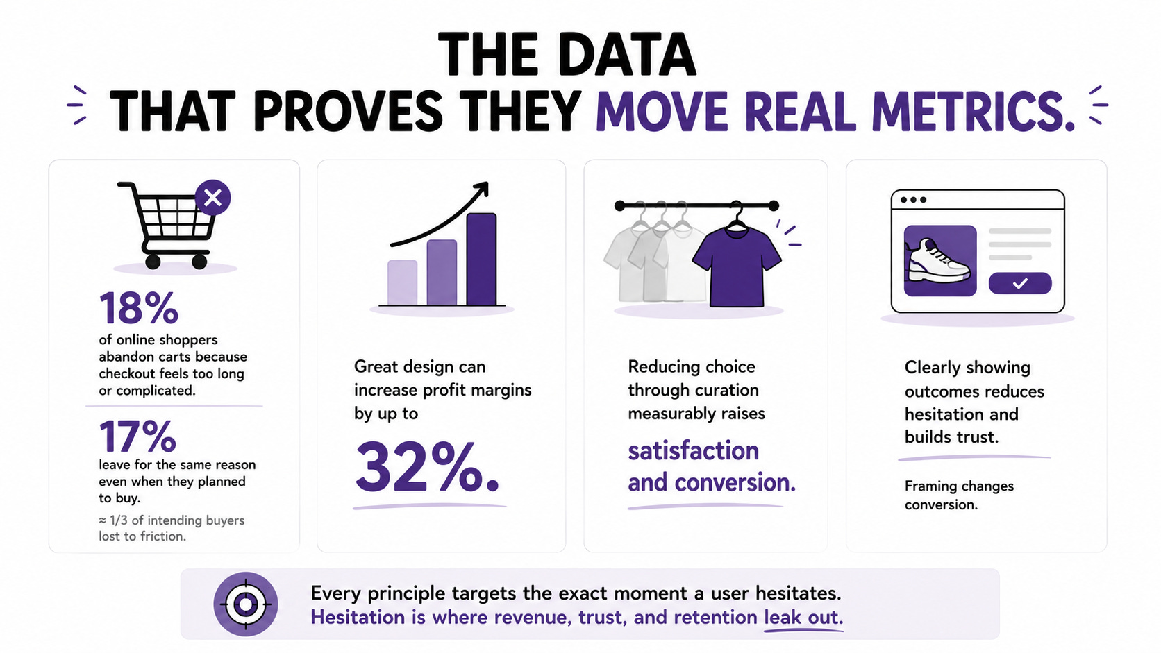
📊 In the US, 18% of online shoppers abandon carts because checkout feels too long or complicated, and another 17% leave for the same reason even when they already planned to buy. That is roughly a third of intending buyers lost to friction that behavioral design directly addresses.
📊 Great design can increase profit margins by up to 32%. Design is not decoration on top of the business. It is a lever on the business.
📊 Reducing choice through curation measurably raises both satisfaction and conversion. In e-commerce, understanding decision fatigue and simplifying options has become a standard way to lift results, because too many choices overwhelm users into leaving.
📊 Clearly showing outcomes reduces hesitation and builds trust. The more concrete and benefit-focused an experience feels, the easier it is for people to say yes. Framing is not cosmetic. It changes conversion.
The through-line: every one of these principles targets the exact moment a user hesitates, and hesitation is where revenue, trust, and retention quietly leak out of a product.
The Ethical Line You Do Not Cross
This is where behavioral design gets serious, and where responsible practitioners separate themselves.
The same principles that reduce friction can be twisted into manipulation. Persuasion helps users make decisions that serve them. Manipulation pressures them into decisions that serve only you. The difference is who benefits.
The rules worth holding to:
▸ Do not fake scarcity. Claiming a product is nearly sold out just to force a purchase is dishonest, and increasingly illegal.
▸ Use urgency signals sparingly and truthfully. “3 people are viewing this” should only appear if it is real.
▸ Respect autonomy. Provide clear information and real choices. Persuade, do not coerce.
▸ Respect privacy. Personalization should help, not feel like surveillance.
The goal is to improve the experience and facilitate navigation, not to pressure or harass users with malicious tactics. Every principle in this issue can be used to help a user get what they came for faster, or to trick them. Use them for the first. The second is now a legal liability, not just an ethical one.
A Practical Audit For Your Own Product
Run your product through these questions this week.
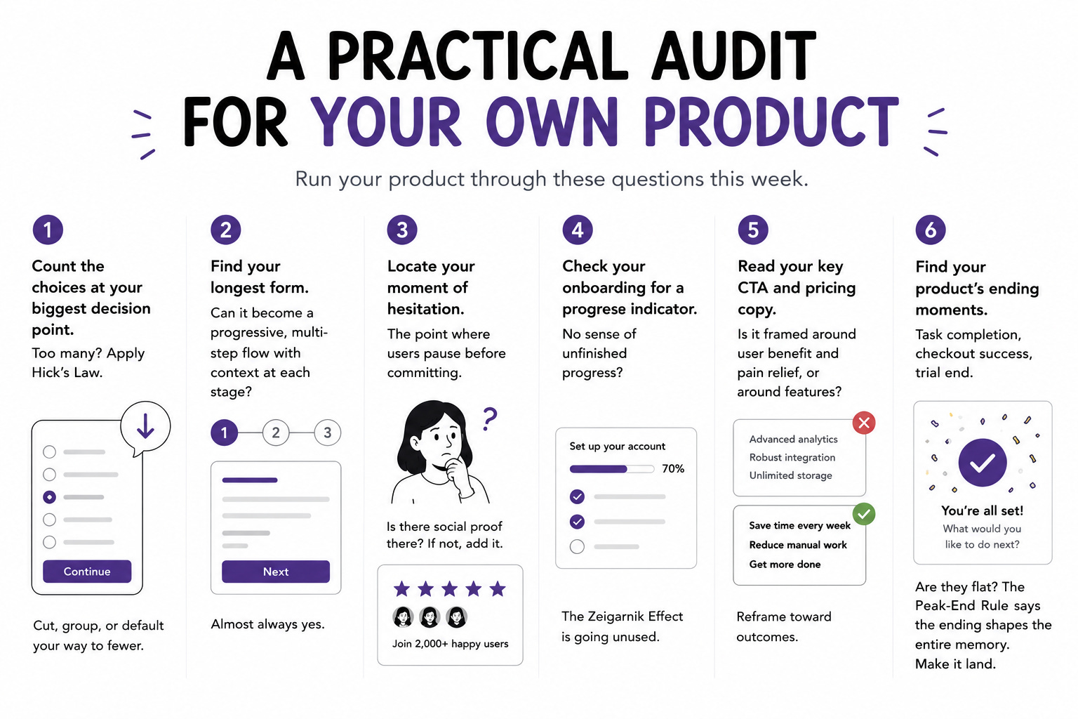
✅ Count the choices at your biggest decision point. Too many? Apply Hick’s Law. Cut, group, or default your way to fewer.
✅ Find your longest form. Can it become a progressive, multi-step flow with context at each stage? Almost always yes.
✅ Locate your moment of hesitation. The point where users pause before committing. Is there social proof there? If not, add it.
✅ Check your onboarding for a progress indicator. No sense of unfinished progress? The Zeigarnik Effect is going unused.
✅ Read your key CTA and pricing copy. Is it framed around user benefit and pain relief, or around features? Reframe toward outcomes.
✅ Find your product’s ending moments. Task completion, checkout success, trial end. Are they flat? The Peak-End Rule says the ending shapes the entire memory. Make it land.
📦 Resource Corner
Thinking, Fast and Slow by Daniel Kahneman
The foundational text on how people actually make decisions. Dense but essential. Every principle in this issue traces back to the two-system model of thinking Kahneman lays out here.
Laws of UX by Jon Yablonski
The cleanest reference for Hick’s Law, the Zeigarnik Effect, the Peak-End Rule, and more. Bookmark it and pull it up every time you need to name and defend a design decision.
18 User Psychology Concepts for UX Design (Userflow)
A practical, current catalogue of psychology principles with specific application examples for each. One of the best free references for turning theory into interface decisions.
How to Use Behavioural Psychology in UX (UX Playbook)
Ben McCarthy-Jones on applying these principles and, crucially, selling them to stakeholders. The section on why naming principles gives you leverage is worth the read alone.
Psychology for UX: Study Guide (Nielsen Norman Group)
A structured path through the psychology that matters most for UX. Ideal if you want to build real depth here rather than collect isolated tricks.
💭 Final Thought
There is a quiet shift that happens when you stop designing screens and start designing for minds.
You stop asking “does this look right” and start asking “what is the person thinking, feeling, and deciding at this exact moment, and does my design work with that or against it.” The first question produces attractive products. The second produces products that feel effortless, the ones people use without friction and cannot quite explain why they prefer.
The principles are not secrets. They are documented, researched, and available to anyone willing to learn the names. What separates practitioners who use them well is not knowledge. It is the discipline to apply them in service of the user, at the exact moments where a little less friction makes all the difference.
Learn the names. Apply them with the person’s interest at heart. Watch effortless stop being an accident and start being something you can design on purpose.
Open your product. Find one moment of hesitation. Fix it with one principle.
Then find the next.


