


Your wireframes look like final designs. Perfect spacing. Carefully chosen grays. Proper typography. Icons from your design system. They’re beautiful. And that’s the problem. You spent 3 hours making wireframes that should have taken 20 minutes, and now you’re emotionally attached to ideas you haven’t validated yet.
This issue breaks down why wireframe perfection is killing your process, what wireframes are actually for, and how to get comfortable with ugly, fast, throwaway sketches that actually move projects forward.
In this issue:
Why “low-fidelity” stopped being low-fidelity
What you lose when wireframes look too finished
The speed vs. fidelity tradeoff nobody talks about
How to actually wireframe fast (and stay fast)
When to add fidelity (and when to stay scrappy)
📦 Resource Corner
But first…..
JOIN OUR TEAM
We are looking for a Community Engagement and Service Design Lead to support a community-funded initiative focused on strengthening relationships with local businesses and improving participation across a commercial corridor in Maryland.
If you are a strong communicator, a relationship builder, and available for some in-person work in the Maryland area, this one is for you.
Why “low-fidelity” stopped being low-fidelity
Somewhere along the way, wireframes stopped being quick sketches and became mini design comps. Open most designers’ Figma files and their “low-fidelity wireframes” have:
Carefully chosen gray scales (
#F5F5F5for backgrounds,#666666for text)Proper 8px spacing grid applied
Icons from a wireframe icon set
Thoughtful typography hierarchy
Subtle borders and shadows
Component instances from their design system
This isn’t low-fidelity. This is medium-fidelity pretending to be low-fidelity. And it defeats the entire purpose of wireframing.
Here’s what happened:
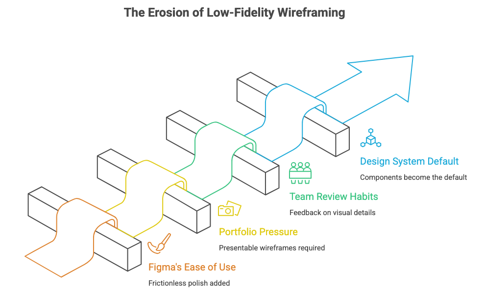
🔹 Figma made it too easy to make things pretty Auto-layout, components, shared libraries. These tools are incredible for final design. But they made it frictionless to add polish to wireframes. So designers do, even when they shouldn’t.
🔹 Portfolios created pressure for “presentable” wireframes Case studies show polished wireframes because they look better in screenshots. Students and juniors copy this, thinking wireframes are supposed to look designed. They’re not.
🔹 Teams started reviewing wireframes like designs Stakeholders see clean wireframes and start giving feedback on visual details: “Can we try a different shade of gray?” “These buttons feel too rounded.” That’s not the conversation you should be having yet.
🔹 Design systems made components the default If your button component already exists, why not use it in wireframes? Because now you’re thinking about component states, variants, and styling instead of flow and structure.
The result: Designers spend hours creating wireframes that should take minutes. And worse, they start defending those wireframes like they’re finished designs because they invested so much time in them. (Source: “Sketching User Experiences” by Bill Buxton)
What you lose when wireframes look too finished
Pretty wireframes aren’t just slower. They actually damage your process in specific, measurable ways.
Here’s what breaks when wireframes are too polished:
❌ You get attached to ideas too early When you spend 3 hours making a wireframe pixel-perfect, you don’t want to throw it away. So when testing or feedback suggests a different approach, you resist. You try to make the current design work instead of exploring alternatives.
This is called the sunk cost fallacy: you’ve invested time, so you keep investing more even when you should cut your losses. (Source: Behavioral Economics research)
❌ Stakeholders critique the wrong things Show someone a rough sketch and they’ll say “I’m not sure this flow makes sense.” Show them a polished wireframe and they’ll say “Can we make this button blue?” or “I don’t like that font.”
Polish invites polish-focused feedback. Roughness invites structure-focused feedback. You need the second kind early in the process.
❌ You explore fewer options If each wireframe takes 2-3 hours, you’ll make 2-3 options max. If each wireframe takes 15 minutes, you’ll make 6-8 options. More options means better chance of finding the right solution.
Speed enables exploration. Polish kills it.
❌ You skip iteration When wireframes feel “done,” you move to high-fidelity instead of testing and iterating. But wireframes aren’t supposed to be done. They’re supposed to be tested, broken, rebuilt, and tested again.
❌ You conflate two different problems Wireframing should answer: Does this structure work? Does this flow make sense? Is this the right information hierarchy?
Visual design should answer: Does this feel like our brand? Is this accessible? Does this create the right emotional response?
When wireframes look designed, you’re trying to answer both sets of questions simultaneously. That’s slower and less effective than solving them sequentially.
💡 Reality check: If your wireframe could be mistaken for a grayscale final design, you’ve already added too much fidelity.
The speed vs. fidelity tradeoff nobody talks about
There’s a direct relationship between how good a wireframe looks and how much it costs to make. That cost isn’t just time. It’s flexibility, iteration, and exploration.
Here’s the actual tradeoff:
Paper sketch: 2-5 minutes
Fastest to create, easiest to throw away
Forces focus on structure, not details
Can’t get attached because it’s obviously temporary
Perfect for initial ideation and very early exploration
Limitation: Hard to share remotely, can’t click through
Digital low-fi (actual low-fi): 10-20 minutes
Boxes, lines, placeholder text
No real typography, no careful spacing, no icons
Fast enough to make 5-10 variations
Easy to test structure and flow
Can be shared and clicked through
This is what wireframes should be most of the time
Digital medium-fi (what most people call “low-fi”): 1-3 hours
Proper spacing, thoughtful grays, icon sets
Starts to look presentable
Slow enough that you’ll only make 2-3 options
Stakeholders start critiquing visual details
This should only happen after you’ve validated the structure
High-fidelity: 3-8 hours
Real typography, brand colors, final spacing
Component instances, proper states
Looks like the final product
Way too slow for exploration
Only do this after everything else is validated
Most designers skip levels 1 and 2 and start at level 3. They call it “low-fidelity” but it’s not. And that skipping costs them speed, flexibility, and better solutions.
Before we continue, let’s talk about something important.
📍 Join us at DCTECH
Did you know that 70% of professionals landed their job at a company where they already knew someone?
Or that 54% of U.S. workers in 2025 were hired through a personal connection, not a job board, not a cold application?
Yet most of us still spend more time perfecting our LinkedIn profiles than actually being in the room where it happens.
Here’s your room.

───────────────────
🍹 DC Tech Happy Hour
Thursday, April 2 | 6:30 – 9:00 PM
Mission Dupont Circle, Washington DC
───────────────────
Refresh DC, Friends of Figma, UXDX & User Experience University are bringing together DC’s UX designers, product managers, researchers, and engineers for a night built around real connection.
And because showing up should come with perks:
🎟️ Win a FREE ticket to UXCON26
🎓 Every attendee gets 25% off UXCON26 just for coming
The tech workforce is projected to grow twice as fast as the overall U.S. workforce over the next decade. The people in that room on April 2nd? They’re part of that growth story, and so are you.
Don’t just read about the DC tech scene. Be in it.
Back to wireframes.
How to actually wireframe fast (and stay fast)
If you’re used to making pretty wireframes, forcing yourself to work faster and rougher feels uncomfortable. Here’s how to do it:
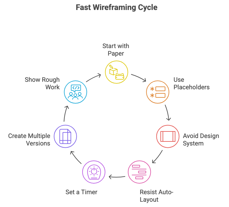
1. Start with paper (yes, actually)
Before touching Figma, spend 10 minutes with a pen and paper. Draw boxes. Scribble labels. Try 3-4 different layouts. This forces speed and prevents attachment.
You can’t make paper look polished, so you focus on what matters: does this structure make sense?
2. Use placeholder rectangles, not real content
Don’t write actual copy. Don’t find real images. Use gray boxes labeled “Headline” and “Product image.”
Why? Because real content tempts you to make it look good. Placeholders keep you focused on structure.
3. Don’t use your design system components yet
Make a simple rectangle and label it “Button.” Don’t instantiate your actual button component. That component has states, variants, and styling you don’t need to think about yet.
4. Resist auto-layout until later
Auto-layout is incredible for final designs. But in wireframes, it tempts you to perfect the spacing. Just stack boxes roughly. Alignment can be ugly. That’s fine.
5. Set a timer
Give yourself 15 minutes for a wireframe. When the timer goes off, you’re done whether it’s perfect or not. This forces you to focus on the essential structure and skip the polish.
This feels uncomfortable at first. You’ll want to adjust spacing, fix alignment, choose better grays. Don’t. The timer is your constraint. (Source: Timeboxing methodology)
6. Make 5 versions before picking one
Force yourself to explore. “What if the nav was here instead?” “What if this was one screen instead of two?” “What if we showed less information?”
You can only do this if each version is fast. If each one takes 2 hours, you’ll only make one and defend it to death.
7. Show your rough work to stakeholders
Yes, it feels vulnerable to show sketchy wireframes. Do it anyway. Say: “These are rough explorations to validate the structure before I add any design. Which direction feels right?”
Stakeholders appreciate being involved early. And rough wireframes keep the conversation focused on what matters.
When to add fidelity (and when to stay scrappy)
This doesn’t mean wireframes should always be ugly. There are specific moments when adding fidelity is the right move.
When to add fidelity:
✅ After you’ve tested the rough structure You made 5 rough wireframes, tested them with users or stakeholders, and now you know which direction works. Now you can add fidelity to that one direction.
✅ When you need to communicate specific interactions If the design depends on a particular micro-interaction or animation, rough boxes won’t communicate it. You need enough fidelity to show the interaction.
✅ When you’re handing off to developers Developers need more detail than stakeholders. Once the structure is validated, add fidelity so they understand spacing, component usage, and behavior.
✅ For your portfolio Yeah, polished wireframes look better in case studies. That’s fine. Just don’t create that polish during the actual design process. Clean them up afterwards for presentation.
When to stay rough:
✅ Any time you’re still exploring If you haven’t validated the approach yet, stay rough. You need speed and flexibility more than polish.
✅ When you’re testing with users Users don’t need pretty wireframes. They need something they can react to and critique. Rough works fine for usability testing.
✅ Early stakeholder reviews Show rough work early. Get directional feedback before investing in polish. This saves you from polishing the wrong thing.
✅ When you’re working on flow, not screens If you’re mapping a user journey or designing a multi-step process, stay rough. You’re solving for sequence and logic, not visual design.
The pattern: Add fidelity as certainty increases. Early in the process when everything is uncertain, stay rough. Later when you’ve validated the direction, add polish.
🎯 Take-home: Fidelity is a tool. Use it strategically, not by default.
📦 Resource Corner
Sketching User Experiences by Bill Buxton The foundational text on why sketching and rough exploration matter. Strong on the relationship between speed and creativity.
Wireframing for Everyone (NN/g) Research-backed guidance on when and how to wireframe. Good on the spectrum from rough to polished.
Balsamiq Wireframing tool that’s intentionally ugly. Forces you to stay rough by making polish difficult. Good training wheels for learning to wireframe fast.
Crazy 8s Exercise (Design Sprint) Rapid sketching exercise that forces you to generate 8 ideas in 8 minutes. Builds the muscle of quick, rough ideation.
Excalidraw Free sketching tool with a hand-drawn aesthetic. Makes it easy to stay rough and prevents over-polishing.
💭 Final Thought
The best wireframes are the ones you’re willing to throw away. And you’re only willing to throw something away if it didn’t cost much to make.
When you spend hours perfecting a wireframe, you’ve created emotional attachment. You’ll defend it even when evidence suggests it’s wrong. You’ll resist feedback. You’ll skip exploration because exploring means discarding your invested time.
But when a wireframe takes 15 minutes? Throw it away. Make another one. Try five different approaches. Test them. Break them. Start over. That’s how you find great solutions, not by making your first idea pretty.
Pretty wireframes aren’t a sign of craft. They’re a sign of premature optimization. You’re solving the wrong problem at the wrong time.
Stay rough longer. Explore more. Polish less. Your work will get better, not worse.

