


Users decide if they trust your product in 0.05 seconds. That is not a typo. Fifty milliseconds, faster than a blink, before they have read a word.
Most teams spend months on features and almost no time on the tiny things that decide whether anyone sticks around to see them. And the tiny things carry shocking price tags. A one-second delay. A form field in the wrong place. A checkout with one extra step. Each looks minor. Each quietly bleeds real money, and the data proves it.
Here is what small UX mistakes actually cost, and how to fix the ones draining your product right now.
In this issue:
The 0.05-second verdict
Speed: the most expensive detail
The checkout leaks costing billions
Mobile: Where it gets worse
The five fixes worth doing first
Resource Corner
BUT. This belongs in the room.
🎯 FALL TECH HAPPY HOUR

The job market shifted. The way people hire shifted with it. Warm intros beat cold applications. A five-minute conversation beats a hundred cover letters. And the people who get ahead aren’t the ones refreshing job boards, they’re the ones already in the room.
This is that room.
DMV’s UX, product, design, and tech community, in one place, for one evening. No stage, no pitch, no agenda. Just the people who can actually move things forward for you, face to face.
Fall Tech Happy Hour. September 24. The Urban Winery, Silver Spring.
The 0.05-second verdict
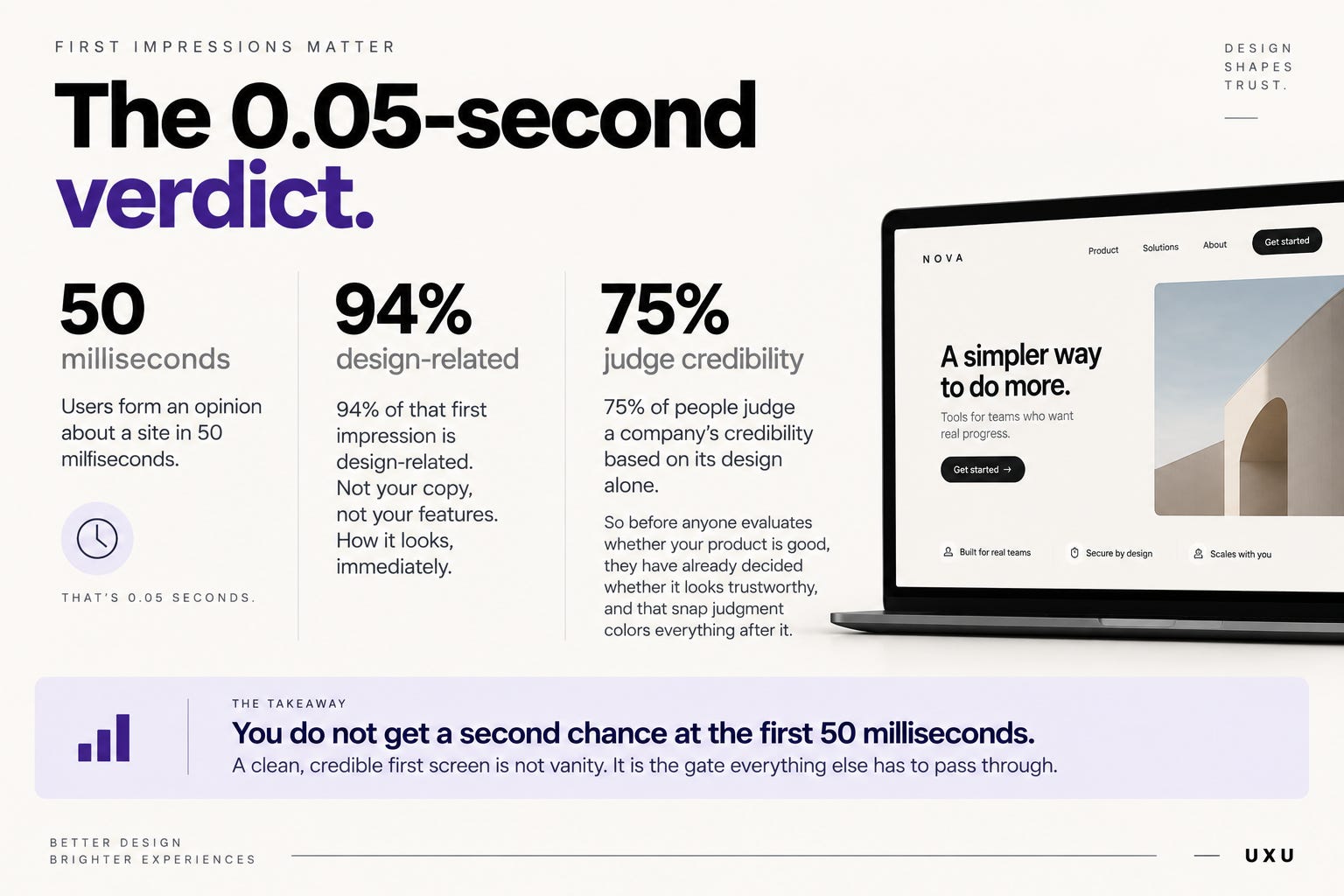
First impressions are almost entirely visual, and almost instant.
Users form an opinion about a site in 50 milliseconds. And 94% of that first impression is design-related. Not your copy, not your features. How it looks, immediately.
It gets higher-stakes. 75% of people judge a company’s credibility based on its design alone. So before anyone evaluates whether your product is good, they have already decided whether it looks trustworthy, and that snap judgment colors everything after it.
The takeaway is blunt: you do not get a second chance at the first 50 milliseconds. A clean, credible first screen is not vanity. It is the gate everything else has to pass through.
Speed: the most expensive detail
If one number changes how you work, make it this one: each additional second of load time cuts conversions by 7%.
The curve is brutal. A page that loads in 1 second converts at around 40%. At 3 seconds, that drops to 29%. At 5 seconds and beyond, it falls off a cliff. As load time climbs from 1 to 10 seconds, bounce probability jumps 123%.
And people will not wait. 53% of mobile users abandon a site that takes more than 3 seconds to load. 47% expect any site to load in under 2. Slow is not a mild annoyance. It is an exit.
The money is staggering at scale. Retailers lose an estimated $2.6 billion a year to slow websites. Even a 0.1-second improvement has been shown to lift conversions by 8%. A tenth of a second, measurable in revenue.
Speed is invisible when it works and catastrophic when it does not. It is also one of the most fixable problems on this list.
The checkout leaks costing billions
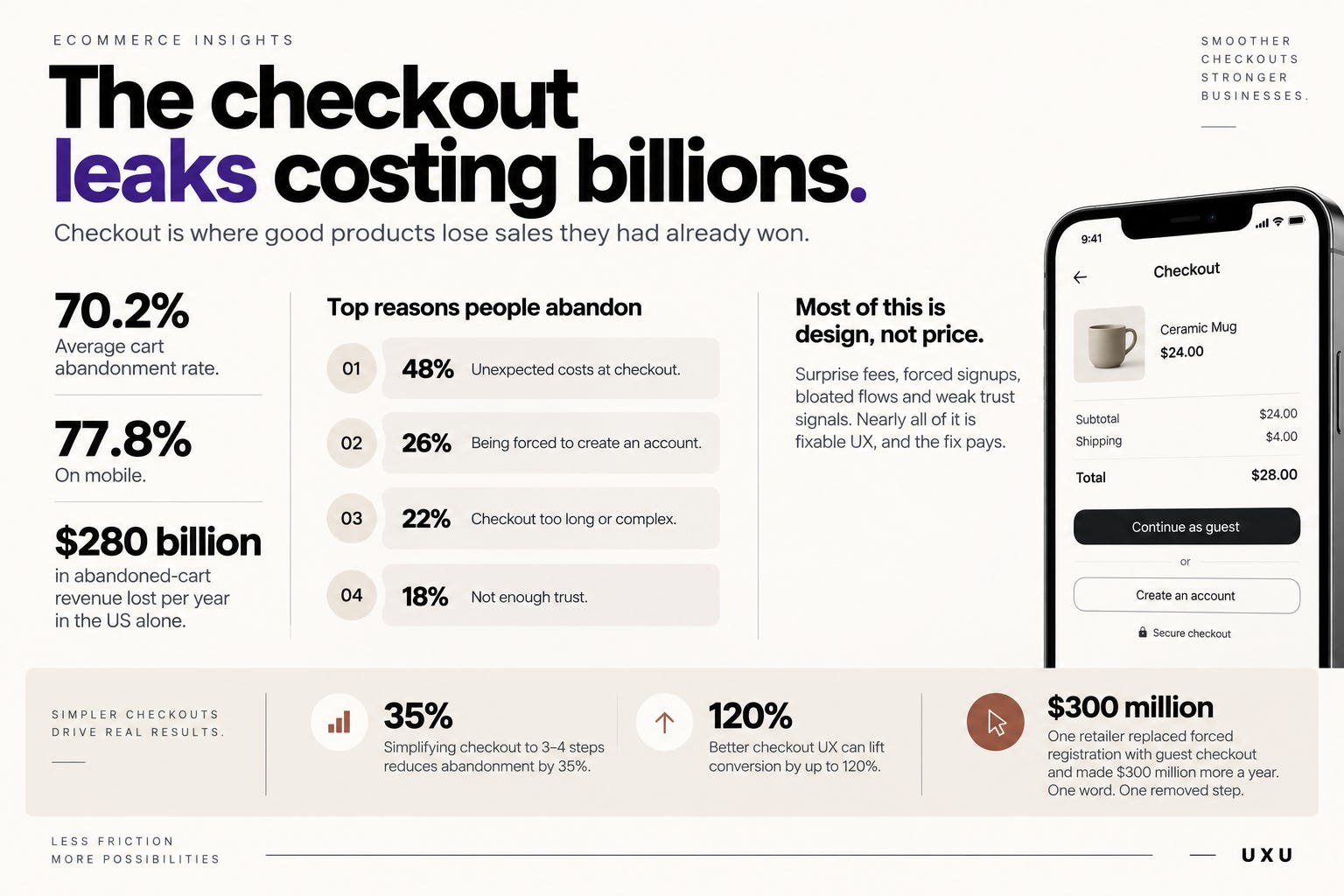
Checkout is where good products lose sales they had already won. The average cart abandonment rate is 70.2%. On mobile, 77.8%.
The total damage: roughly $280 billion in abandoned-cart revenue lost per year in the US alone.
Here is the part that should sting, because most of it is design, not price. The top reasons people abandon:
▸ Unexpected costs at checkout: 48%
▸ Being forced to create an account: 26%
▸ Checkout too long or complex: 22%
▸ Not enough trust: 18%
Look at that list. Nearly all of it is fixable UX, not pricing. Surprise fees, forced signups, bloated flows, weak trust signals. And the fix pays: simplifying checkout to 3 to 4 steps reduces abandonment by 35%. Better checkout UX can lift conversion by up to 120%.
Remember the famous “Continue” button? One retailer replaced forced registration with guest checkout and made $300 million more a year. One word. One removed step.
Mobile: where it gets worse
Mobile is now 58 to 63% of web traffic. It is also where the numbers get ugly.
Desktop converts at 4.3%. Mobile converts at 2.1%, less than half. Part of that is context, but a lot of it is design that was never truly built for a thumb.
The friction shows up in the details. Form entry on touchscreens has a 25% error rate. Each error adds about 45 seconds and raises abandonment by 18%. And tap targets smaller than 48×48 pixels cause 38% of mobile form errors. Undersized buttons are not a minor polish issue. They are a measurable revenue leak.
Speed is worse on mobile too. Average mobile load time globally is 8.6 seconds, against a 3-second patience limit. The gap between what users tolerate and what they get is enormous, and every second in that gap is costing you.
The five fixes worth doing first
Ranked by impact. Most are doable this week.
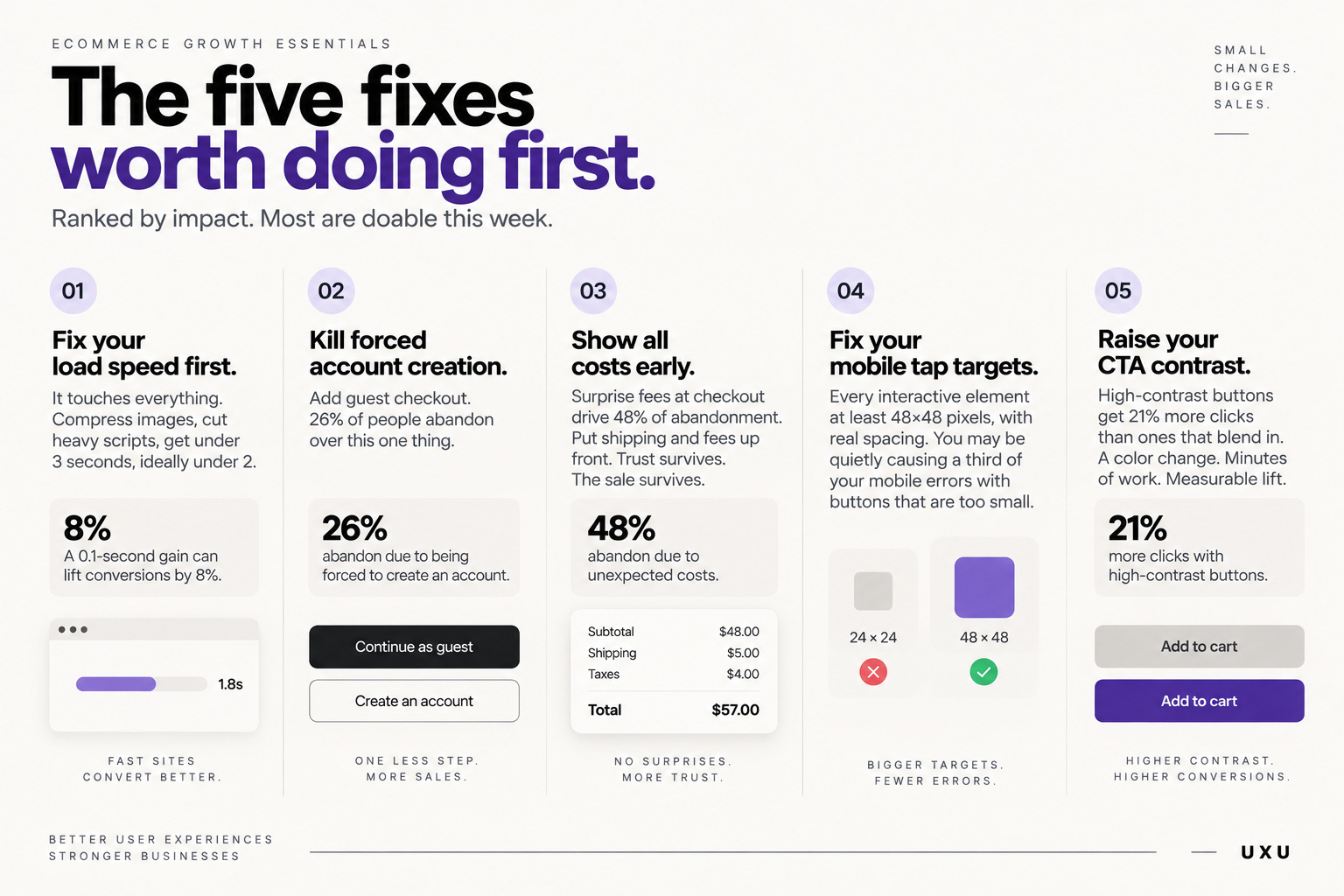
✅ Fix your load speed first. It touches everything. Compress images, cut heavy scripts, get under 3 seconds, ideally under 2. A 0.1-second gain can lift conversions 8%. Highest return of anything here.
✅ Kill forced account creation. Add guest checkout. 26% of people abandon over this one thing. This is the $300 million button. Do it now.
✅ Show all costs early. Surprise fees at checkout drive 48% of abandonment. Put shipping and fees up front. Trust survives. The sale survives.
✅ Fix your mobile tap targets. Every interactive element at least 48×48 pixels, with real spacing. You may be quietly causing a third of your mobile errors with buttons that are too small.
✅ Raise your CTA contrast. High-contrast buttons get 21% more clicks than ones that blend in. A color change. Minutes of work. Measurable lift.
📦 Resource Corner
UX & UI Design Statistics 2026 (Searchlab)
A clean, sourced dashboard of the numbers in this issue. Bookmark it for the next time you need a hard stat to win an argument with a stakeholder.
Baymard Institute
The gold standard for checkout and e-commerce UX research. The source behind the cart abandonment data, with specific, tested fixes. If you touch checkout, this is essential.
Website Speed Statistics 2026 (Netstager)
The full breakdown of load time versus conversion, plus the top speed fixes ranked by impact. The clearest case for treating speed as a UX priority, not just an engineering one.
43 UX Statistics to Bookmark in 2026 (Tenet)
A broad, current collection of citable UX data across speed, navigation, mobile, and trust. Useful ammunition for building any business case.
Don’t Make Me Think by Steve Krug
The classic on removing friction. Short, practical, and the perfect complement to the numbers here. The stats show the cost; Krug shows the fix.
💭 Final Thought
Features get the roadmap. Details lose the customer.
A one-second delay. A forced signup. A tap target too small. None of it makes a launch announcement. All of it quietly decides whether the work you spent months on ever gets a fair look.
The good news: these are the cheapest wins in your whole product. A faster page. One fewer step. A bigger button. Small changes, measurable money.
Open your product. Time the load. Count the checkout steps. Tap a button with your thumb.
The leaks are there. Now you know what they cost.


