


You spent 20 minutes perfecting that error message. You workshopped the empty state copy with your team. You added helpful tooltips everywhere. And users are still confused, still making mistakes, still asking support questions that your interface already answers. Here’s the truth: people don’t read. They scan, they guess, and they click.
This issue breaks down why most interface copy fails, what actually gets read, and how to write copy that works with human behavior instead of against it.
In this issue:
Why users don’t read (even when they should)
The 3-second rule for interface copy
What users actually look at instead of reading
How to write copy that gets used, not skipped
When more words make things worse
📦 Resource Corner
Why users don’t read (even when they should)
Let’s start with the uncomfortable reality: users don’t read interfaces. They scan them.
This isn’t laziness. It’s not stupidity. It’s how humans efficiently process information when they’re trying to accomplish a task. Your users aren’t visiting your app to read. They’re visiting to do something. Reading is friction between them and their goal.
Steve Krug documented this decades ago in “Don’t Make Me Think”: users satisfice. They don’t look for the best option, they look for the first option that seems good enough. (Source: “Don’t Make Me Think” by Steve Krug)
Here’s what actually happens when someone opens your interface:
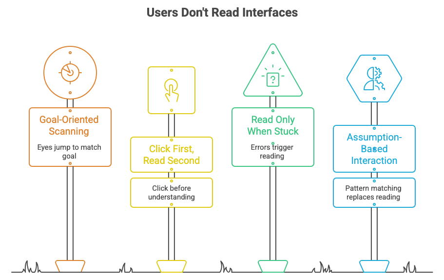
🔹 They scan for their goal Their eyes jump around looking for something that matches what they’re trying to do. A button. A link. A familiar pattern. They’re not starting at the top and reading down. They’re hunting.
🔹 They click first, read second (maybe) If something looks clickable and seems related to their goal, they click it. They don’t read the description first. They don’t hover for the tooltip. They just click and see what happens.
🔹 They only read when they’re stuck Error messages get read because something went wrong. Help text gets read when users have already tried and failed. Onboarding copy gets skipped unless the user is completely lost.
🔹 They assume, based on past experience That blue underlined text is probably a link. That X in the corner probably closes the modal. That form probably wants their email and password. They’re pattern-matching based on every other interface they’ve used, not reading your specific instructions.
The data backs this up: Eye-tracking studies consistently show that users fixate on interactive elements, images, and short labels. They skip paragraphs, ignore help text, and don’t read instructions until they’ve already made a mistake. (Source: Nielsen Norman Group Eye-Tracking Research)
This doesn’t mean copy doesn’t matter. It means copy needs to work with scanning behavior, not against it.
before we continue..
Did you know that 70% of professionals landed their job at a company where they already knew someone?
Or that 54% of U.S. workers in 2025 were hired through a personal connection, not a job board, not a cold application?
Yet most of us still spend more time perfecting our LinkedIn profiles than actually being in the room where it happens.
Here’s your room.

───────────────────
🍹 DC Tech Happy Hour
Thursday, April 2 | 6:30 – 9:00 PM
Mission Dupont Circle, Washington DC
───────────────────
Refresh DC, Friends of Figma, UXDX & User Experience University are bringing together DC’s UX designers, product managers, researchers, and engineers for a night built around real connection.
And because showing up should come with perks:
🎟️ Win a FREE ticket to UXCON26
🎓 Every attendee gets 25% off UXCON26 just for coming
The tech workforce is projected to grow twice as fast as the overall U.S. workforce over the next decade. The people in that room on April 2nd? They’re part of that growth story, and so are you.
Don’t just read about the DC tech scene. Be in it.
back to where we stopped….
The 3-second rule for interface copy
Here’s a useful heuristic: if users can’t understand what to do in 3 seconds, your copy failed.
Not 3 seconds of reading. 3 seconds of looking at the screen. That’s how long you have to communicate:
Where am I?
What can I do here?
What should I do next?
If it takes longer than that, users start guessing. And guesses lead to mistakes, confusion, and abandoned tasks.
What this means in practice:
❌ This error message takes too long to parse: “We were unable to process your payment at this time due to insufficient funds in the account you provided. Please verify your account balance and try again, or use an alternative payment method.”
✅ This one works instantly: “Payment failed: Insufficient funds. Try a different card?”
The second version gives you the critical information (what failed, why, what to do) in one glance. The first version makes you read a paragraph to get the same information.
❌ This empty state is verbose: “You haven’t created any projects yet. Projects help you organize your work into manageable collections. To get started, click the ‘New Project’ button above and you’ll be guided through the setup process.”
✅ This one gets to the point: “No projects yet. Create your first one to get started.”
The button already says “New Project.” The empty state doesn’t need to re-explain it.
The pattern: Cut everything that doesn’t directly help the user take the next action. Every extra word is friction.
What users actually look at instead of reading
If users aren’t reading your carefully crafted copy, what are they looking at?
Here’s what gets attention in interfaces:
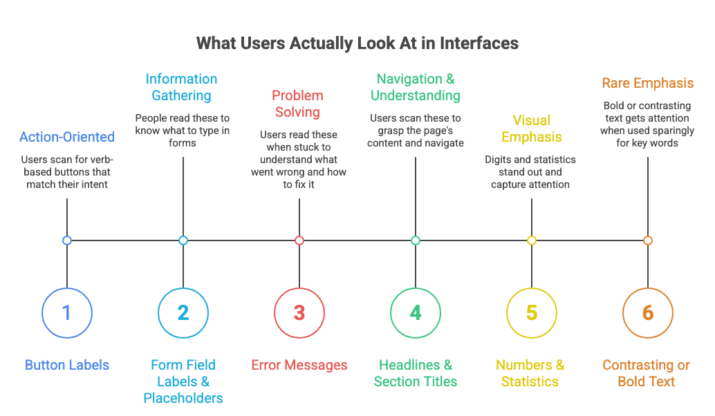
✅ Button labels These get read because they’re attached to actions. Users scan for buttons that match their intent. Make button labels verb-based and specific: “Send message” not “Submit.” “Delete account” not “Confirm.”
✅ Form field labels and placeholders People read these because they need to know what to type. Keep them short and clear. “Email address” is better than “Please enter your email address below.”
✅ Error messages (when something goes wrong) These get read because users are stuck. Make them specific about what failed and what to do next. “Email is required” is clearer than “Please fill in all required fields.”
✅ Headlines and section titles Users scan these to understand what’s on the page. Use clear, descriptive titles. “Billing settings” not “Manage your account.” “Team members” not “Collaboration.”
✅ Numbers and statistics Anything with digits stands out visually. “3 items” gets noticed. “A few items” gets ignored. “Save $20” gets noticed. “Save money” gets ignored.
✅ Contrasting or bold text (sparingly) If you bold one thing, it gets attention. If you bold everything, nothing gets attention. Use emphasis rarely, only for the most important word or phrase.
What gets ignored:
❌ Long paragraphs of explanation ❌ Helper text unless the user is already confused ❌ Tooltips unless the user hovers (and they won’t) ❌ Onboarding that appears before the user has context ❌ Terms and conditions (obviously) ❌ Microcopy that tries to be clever instead of clear
💡 Think like a billboard: You have 3 seconds while someone drives past at 60mph. What’s the minimum you need to communicate?
How to write copy that gets used, not skipped
Knowing that users scan instead of read changes how you should write. Here are the principles that make interface copy actually work:
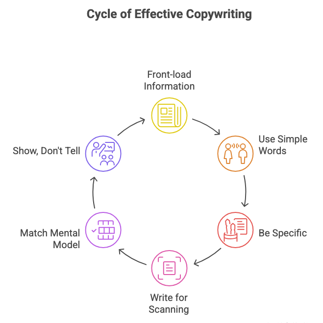
1. Front-load the important information
Don’t bury the action or the consequence at the end of a sentence. Put it first.
❌ “In order to proceed with deleting your account, please confirm by clicking the button below.” ✅ “Delete your account? This can’t be undone.”
The second version tells you what’s happening and the stakes immediately. The first makes you parse a sentence structure to get the same info.
2. Use the simplest words possible
This isn’t about dumbing things down. It’s about reducing cognitive load. Users shouldn’t need to decode your vocabulary to use your interface.
❌ “Utilize the search functionality to locate specific items.” ✅ “Search for items.”
Fancy words slow people down. Simple words get processed instantly. (Source: Plain Language Guidelines)
3. Be specific, not generic
Generic copy forces users to interpret. Specific copy tells them exactly what will happen.
❌ “Are you sure?” (Sure about what?) ✅ “Delete this project?”
❌ “Something went wrong.” (What? Why? What do I do?) ✅ “Couldn’t save changes. Check your internet connection.”
4. Write for scanning, not reading
Structure your copy so key information jumps out:
Use short sentences (10-15 words max)
One idea per sentence
Break up text with line breaks
Put the action word first in buttons
❌ “You can create a new workspace by clicking on the button located in the top right corner of the dashboard.” ✅ “Create a workspace →” (And put that button where users expect it)
5. Match the user’s mental model
Use words users already use, not internal jargon or technically correct terms.
If your users call them “recipes,” don’t call them “formulas” in your interface. If they think of it as “sharing,” don’t label it “collaboration settings.”
This requires actually listening to how users describe things in research sessions. (Source: Mental Models by Indi Young)
6. Show, don’t tell (when possible)
Sometimes you can eliminate copy entirely by making the interface self-evident.
Instead of: “Click the star icon to favorite this item” Just show: ⭐ (and make it obviously clickable)
Instead of: “Drag items to reorder them” Just make items look draggable and respond to drag attempts
Visual affordances often communicate faster than words.
When more words make things worse
There’s a persistent belief in UX that more explanation = better experience. It’s not true. Often, adding more copy makes things harder to use.
Here’s when to cut, not add:
❌ When you’re explaining the interface instead of improving it
If you need a paragraph of help text to explain how a feature works, the feature is probably too complicated. Simplify the interface instead of documenting the complexity.
Example: Don’t write “Click the three dots to open a menu with additional options.” Just use a recognizable menu icon and put the most common actions directly visible.
❌ When you’re repeating information that’s already visible
Don’t tell users to “click the Save button below” if there’s clearly a Save button below. They can see it. The extra instruction is clutter.
❌ When you’re explaining what will happen before users have context
Onboarding tooltips that pop up before users have tried anything are useless. They don’t have the context to understand why they’d need that feature. Show help when it’s relevant, not preemptively.
❌ When you’re adding qualifiers and hedging
“You might want to consider adding a description” is weaker and longer than “Add a description.” Be direct. (Source: Voice and Tone Guidelines)
❌ When you’re being clever instead of clear
“Oops! Looks like gremlins ate your file” might seem fun, but “Upload failed. File too large.” is more useful. Clever is fine for marketing. Clarity is essential for interface copy.
The test: If you remove a sentence and users can still complete the task, that sentence was unnecessary. Cut it.
🎯 Take-home: The best interface copy is invisible. Users accomplish their goal without consciously reading anything.
📦 Resource Corner
Microcopy: The Complete Guide (UX Writing Hub) Comprehensive resource on writing effective interface copy. Full of before/after examples and specific patterns.
Voice and Tone by MailChimp One of the best public content style guides. Shows how to adapt tone for different situations while staying clear.
Strategic Writing for UX (Torrey Podmajersky) Practical book on writing interface copy that drives action. Strong on button labels, error messages, and microcopy patterns.
Don’t Make Me Think by Steve Krug Classic usability book that explains why users scan instead of read. The foundational text for understanding user behavior.
How Users Read on the Web (Nielsen Norman Group) Research-backed article with eye-tracking data showing exactly how people scan interfaces and what they skip.
Readability Guidelines Practical advice on making content readable and scannable. Good on sentence structure, word choice, and formatting.
Plain Language Guidelines (US Government) Government resource, but genuinely useful for writing clear, direct copy. Good checklist for editing down verbose text.
💭 Final Thought
The hardest thing for writers to accept is that most of their words will be ignored. You can craft the perfect error message, write clear onboarding, add helpful tooltips everywhere, and users will still skip most of it.
But that’s not a failure. That’s just how people use interfaces. They’re not there to read. They’re there to do something. Your job is to make that doing as effortless as possible.
Good interface copy doesn’t get read. It gets absorbed in a glance. It communicates instantly. It disappears into the background while users accomplish their goals.
The best compliment your copy can get is silence. No confusion. No support tickets. No users stopping to figure out what you meant. Just smooth, friction-free task completion.
That’s the goal. Not beautiful prose. Not clever wordplay. Just clarity that works so well it’s invisible.
Write less. Say more. Get out of the way.

