


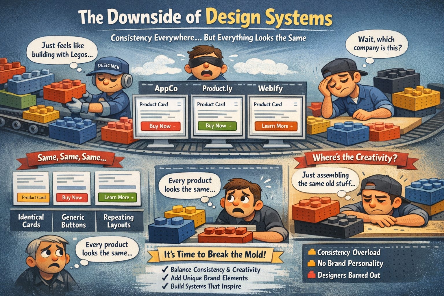
Design systems were supposed to make design faster and more consistent. And they did. But now we have a new problem: every product looks identical. Same card styles. Same button treatments.
Same spacing patterns. Same everything. Users can’t tell companies apart anymore, and designers feel like they’re just assembling Lego blocks instead of actually designing.
Here’s why this happened, when consistency becomes a problem, and how to build systems that help instead of handcuff.
In this issue:
Why every SaaS product looks exactly the same now
The hidden cost of “perfect” consistency
When your design system should bend (or break)
How to build flexibility into rigid systems
The difference between good constraints and creative death
📦 Resource Corner
Why every SaaS product looks exactly the same now
Open five B2B SaaS products right now. Go ahead. Pick any five. Chances are they all have:
White or light gray backgrounds
Blue primary buttons (that exact same shade of blue)
Sans-serif fonts (probably Inter, Roboto, or SF Pro)
8px spacing grid
Rounded corners (4px or 8px radius)
The same card component with subtle shadows
Left-side navigation that collapses to icons
Avatar circles in the top right
Pastel accent colors
That same empty state illustration style
It’s not a coincidence. It’s design system convergence. And it happened fast.
Here’s what caused it:
🔹 Material Design and Apple’s HIG set the template Google and Apple published comprehensive design systems. Companies copied them. Then everyone copied each other. (Source: Material Design)
🔹 Design system libraries became default starting points Ant Design, Chakra UI, MUI, Tailwind UI. These are excellent tools. But when everyone starts from the same component library, everyone ends up with similar-looking products.
🔹 “Best practices” became “only practices” Design blogs and courses taught the same patterns. Use 8px grids. Make buttons 40px tall. Use consistent spacing. These are good guidelines, but they became rigid rules that everyone follows identically.
🔹 Speed became more valuable than differentiation Startups needed to ship fast. Using an off-the-shelf design system was faster than creating a unique visual identity. So they all picked the same systems.
🔹 Designers optimize for internal efficiency over user experience Design systems make it easy to build new screens quickly by reusing components. That’s great for productivity. But it also means every screen starts looking like every other screen, inside your product and across different products.
The result? Visual homogeneity. Products that are technically well-designed but completely forgettable. Users can’t tell them apart. Brands have no visual personality. Everything feels like a template.
The hidden cost of “perfect” consistency
Design systems sold themselves on consistency, and consistency is genuinely valuable. It makes products learnable. It makes design and development faster. It reduces decision fatigue.
But there’s a dark side nobody talks about: over-consistency kills the things that make products memorable.
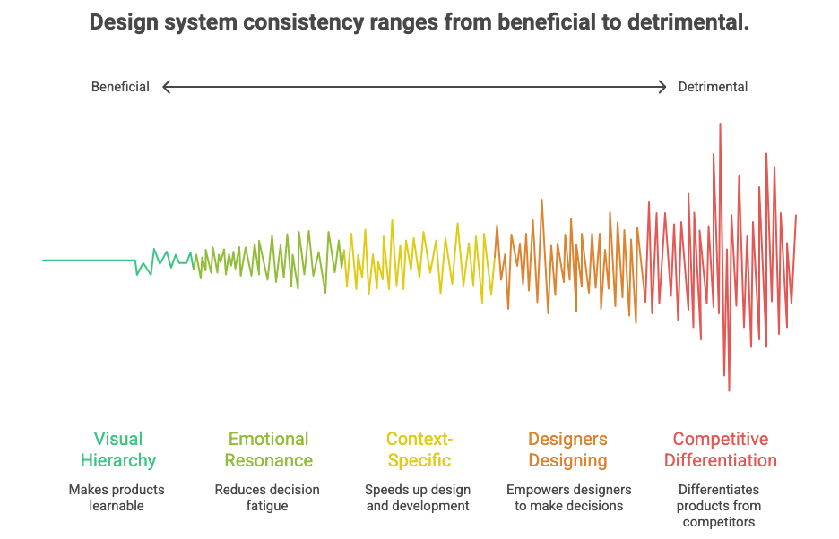
Here’s what gets lost:
❌ Visual hierarchy gets flattened When every button is the same size, every heading uses the same weight, and every card has the same styling, nothing stands out. Everything is equal, which means nothing is important. Users can’t tell what to look at first.
❌ Emotional resonance disappears Great design makes you feel something. It has personality. It surprises you. It delights you. But design systems optimize for predictability, not emotion. Every interaction feels the same, so nothing feels special.
❌ Context-specific solutions become impossible Design systems give you components that work in most situations. But “most situations” is not the same as “this specific situation.” Sometimes the standard button doesn’t work. Sometimes you need something custom. But design systems make custom feel wrong.
❌ Designers stop designing When your job becomes “use the approved components in the approved ways,” you’re not designing anymore. You’re templating. Junior designers never learn how to make design decisions because the system made all the decisions already.
❌ Products lose competitive differentiation If your product looks and works exactly like every competitor, why would users choose you? Visual identity used to be part of brand strategy. Now it’s an afterthought because “we have to be consistent with the system.”
💡 Reality check: Consistency is a tool, not a goal. The goal is a great user experience. Sometimes that requires inconsistency.
Hold up… Join us at UXCON26
The UX landscape is shifting fast. The designers who stay ahead are the ones who invest in their craft and their community.
That’s what UXCON26 is built for.


One packed day of sessions from practitioners solving hard problems right now. Workshops that build real skills. And the kind of hallway conversations that turn strangers into collaborators.
Come ready to be challenged. Leave knowing exactly where your work is headed.
back to where we stopped….
When your design system should bend (or break)
Let’s be clear: not every screen deserves to break the rules. Most of the time, using standard components is the right call. But there are specific moments when following the system too strictly makes the experience worse.
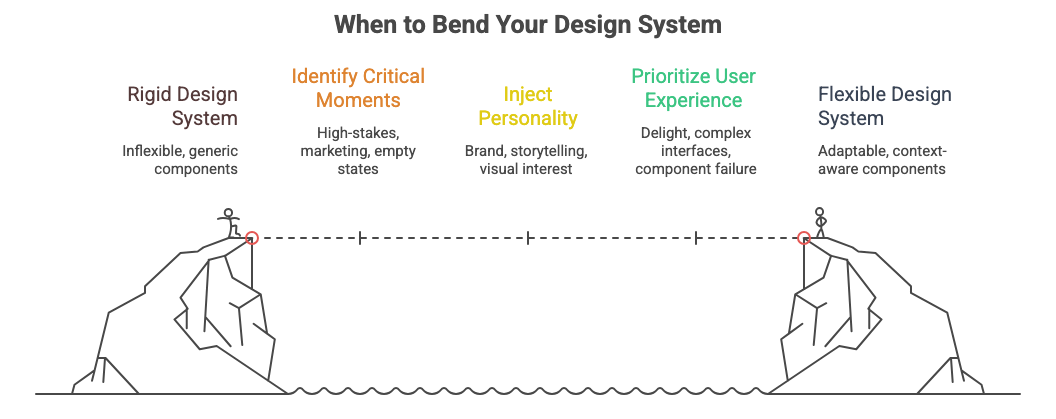
Here’s when to break (or bend) your design system:
✅ High-stakes moments that deserve special treatment
Onboarding. Checkout. Error states that could lose the user. These aren’t normal screens. They’re critical moments in the user journey. They deserve custom design that makes them feel important.
Example: Stripe’s checkout doesn’t look like the rest of their dashboard. It’s visually distinct because the stakes are high and they want users to trust it. (Source: Stripe)
✅ Marketing or landing pages
Your product needs personality to attract users. Marketing pages should feel like your brand, not like every other SaaS dashboard. This is where you tell your story, show your differentiation, and make an emotional connection.
Don’t force landing pages into the same components you use for data tables and settings screens.
✅ Empty states and first-time experiences
These screens have one job: make someone want to use your product. A generic empty state with a standard icon and “No items yet” text doesn’t do that. This is where illustration, storytelling, and visual interest matter.
✅ Moments of delight
Completing a goal. Hitting a milestone. Unlocking something new. These moments should feel special. Use animation, color, unique layouts. Make them memorable. Design systems often strip this out because it’s “off-brand” or “inconsistent.”
✅ Complex, domain-specific interfaces
Financial dashboards. Medical records. Design tools. These have unique requirements that standard components can’t solve. You need custom visualizations, specialized controls, domain-specific patterns.
Trying to force these into a generic design system creates a worse experience than building custom solutions.
✅ When the standard component objectively fails
Sometimes the approved button is too small for this context. Sometimes the standard table doesn’t handle this data well. Sometimes the spacing feels wrong. Trust your design judgment. If the system isn’t working, don’t force it.
The test: Ask yourself: “Is following the system making this experience better or just easier for me?” If it’s just easier, that’s not good enough.
How to build flexibility into rigid systems
The problem isn’t design systems themselves. The problem is how they’re implemented. Most design systems are too rigid because they’re built for consistency above all else.
Here’s how to build systems that enable great design instead of preventing it:
1. Build in multiple levels of components
Not everything needs to be a locked, atomic component. Have three levels:
🔹 Foundations (locked) → Colors, typography, spacing values, grid system. These stay consistent.
🔹 Core components (mostly locked) → Buttons, inputs, cards, modals. Standard patterns that solve common problems. Use these most of the time.
🔹 Flexible patterns (unlocked) → Layout patterns, composition examples, principles instead of rules. These show how to apply the foundations in new ways.
Most systems only have the first two levels. The third level is what gives designers room to solve unique problems. (Source: Nathan Curtis on Design System Levels)
2. Document when to break the rules
Don’t just say “use the button component.” Say “use the button component for standard actions. For high-stakes CTAs or moments that need emphasis, here’s how to create variations.”
Make rule-breaking official. Give designers permission and guidance for when standard components aren’t enough.
3. Use design tokens for easy customization
Instead of hard-coded values, use tokens. This lets you customize components for specific contexts without breaking the system.
Example: Your standard button uses color-primary and spacing-medium. But for your checkout page, you can override those tokens to color-emphasis and spacing-large without rebuilding the component.
4. Show examples of good inconsistency
Include case studies in your design system docs that show when someone broke the rules well and why. This teaches designers how to think, not just what to use.
Example: “We built a custom data visualization for the analytics dashboard because standard charts didn’t show the relationships our users needed to understand.”
5. Make custom components easy to build
Don’t make designers go rogue and build components in isolation. Give them primitives, composable building blocks that let them create new patterns that still feel cohesive.
Example: Instead of only having a “Card” component, have “Box,” “Stack,” and “Text” primitives that designers can compose into custom layouts that still use your spacing and color tokens.
6. Review and absorb good deviations
When designers build something custom that works well, don’t punish them for going off-system. Review it. If it’s good, add it to the system. Let the system evolve based on real needs, not just consistency for consistency’s sake.
🎯 Take-home: The best design systems are living documents that grow with real product needs, not static rulebooks that designers have to fight against.
The difference between good constraints and creative death
Constraints are essential for good design. But there’s a difference between helpful constraints and ones that just kill creativity.
Good constraints:
✅ Limit choices so you can focus on the hard problems
✅ Create a shared language across teams
✅ Prevent designers from reinventing solved problems
✅ Make products learnable because patterns repeat
✅ Speed up implementation of standard screens
Example: “Use our spacing scale (4px, 8px, 16px, 24px, 32px)” is a good constraint. It prevents random spacing and creates visual rhythm without telling you exactly how to use space.
Bad constraints:
❌ Force you to use solutions that don’t work for the problem
❌ Punish designers for solving real user problems
❌ Optimize for visual consistency over user needs
❌ Make every screen feel identical regardless of context
❌ Turn designers into component assemblers instead of problem solvers
Example: “Every screen must use the standard page template with left nav and content area” is a bad constraint if some screens need full-width layouts or different navigation patterns.
How to tell the difference:
Ask: “Does this constraint help me solve the user’s problem, or does it just make my life easier?”
If it’s only making your life easier as a designer or developer, it might be a bad constraint. Good constraints guide you toward better solutions. Bad constraints guide you toward easier solutions.
The balance: Design systems should make common things easy and custom things possible. Right now, most systems make common things easy and custom things impossible.
📦 Resource Corner
Design Systems by Alla Kholmatova One of the best books on building design systems that balance consistency with flexibility. Goes deep on when to systematize and when to leave room for creativity.
Untitled UI A design system that shows how to build flexibility into components. Good examples of how to document variations and when to use them.
Modulz/Radix Component library built on composable primitives instead of rigid components. Shows how to give designers building blocks instead of finished pieces.
Nathan Curtis - EightShapes Nathan writes extensively about design systems. His articles on component levels, documentation, and governance are essential reading.
Design System Governance (NN/g) Research-backed guidance on how to manage design systems without making them too rigid. Good on balancing control and creativity.
Brad Frost - Atomic Design The methodology that started the component-based design system trend. Still valuable for understanding how to think about component hierarchies.
Final Thought
Design systems were supposed to free designers from repetitive decisions so they could focus on hard problems. But we over-corrected. We built systems so rigid that they removed all the decisions, even the important ones.
The goal was never to make everything look the same. The goal was to make the easy stuff easy so designers could spend time on what matters: understanding users, solving real problems, and creating experiences that feel crafted, not templated.
Your design system should be a tool that helps you design better, faster. If it’s preventing you from designing at all, if every screen feels like every other screen, if you’re fighting the system to build something good, then the system is the problem.
Good design systems have rules. Great design systems know when to break them.

