


Every design team says they’re “mobile-first.” But when you look at the actual products, something’s off. The mobile version is polished. The desktop version works great. And then there’s this awkward middle ground where nothing quite fits. Tablets feel like stretched phone apps. Foldable phones break your layouts. And don’t even get started on what happens when someone rotates their device.
Here’s what’s actually happening with screen sizes in 2026, and how to design for reality instead of assumptions.
In this issue:
The screen size distribution that surprised everyone
Why “mobile-first” became “mobile-only” (and why that’s a problem)
The contexts you’re not designing for
Responsive design vs. adaptive design (and when each matters)
How to actually test across real device usage
📦 Resource Corner
The screen size distribution that surprised everyone
Let’s start with data, because what designers assume about device usage and what’s actually happening are often very different.
Here’s what changed in the last few years:
📱 Tablet usage went up, not down Everyone predicted tablets would die. Instead, iPad sales hit record numbers. Android tablets made a comeback. And crucially, people started using tablets for work tasks, not just media consumption. (Source: Statcounter Global Stats)
💻 Laptop screens got smaller and touch-enabled The 13-inch MacBook became the default. Surface devices and Chromebooks blurred the line between tablet and laptop. Suddenly you have desktop browsers on small screens with touch input.
📱 Phone screens got bigger and foldable The average phone screen size is now over 6 inches. Samsung’s foldables open to tablet size. The “small mobile screen” you’re designing for might be bigger than some laptops.
🖥️ Ultra-wide monitors became common 34-inch curved monitors. Multiple displays. People running your web app at 3440x1440 resolution. Your 1440px max-width container looks tiny on these screens.
What this means: The old breakpoints don’t match reality anymore. Designing for “mobile” at 375px, “tablet” at 768px, and “desktop” at 1024px misses huge chunks of real usage.
Hold up… Join us at UXCON26
The UX landscape is shifting fast. The designers who stay ahead are the ones who invest in their craft and their community.


That’s what UXCON26 is built for.
One packed day of sessions from practitioners solving hard problems right now. Workshops that build real skills. And the kind of hallway conversations that turn strangers into collaborators.
Come ready to be challenged. Leave knowing exactly where your work is headed.
back to where we stopped…..
Why “mobile-first” became “mobile-only” (and why that’s a problem)
Mobile-first was supposed to mean: start with the most constrained experience, then progressively enhance for larger screens. It was about prioritization and clarity.
But somewhere along the way, it became: design for phones, then stretch it for everything else.
Here’s what that looks like in practice:
🔴 Tablet apps that are just blown-up phone interfaces Giant buttons. Huge whitespace. Single column layouts on a 12-inch screen. It works, technically. But it wastes the screen real estate and feels awkward to use.
🔴 Desktop experiences that feel like phone apps Hamburger menus on a 27-inch monitor. One column of content in the middle of a massive screen. Navigation hidden behind icons because “that’s how we do it on mobile.”
🔴 Features that only exist on one platform “Swipe to delete” only works on touch. Keyboard shortcuts only work on desktop. Hover states only work with a mouse. So features appear and disappear depending on what device you’re using.
🔴 Layouts that break when rotated Design for portrait phone. Test in portrait phone. Ship it. Then someone rotates to landscape and half the UI is cut off or the layout collapses awkwardly.
The root problem: Teams design mobile-first but test mobile-only. They assume other screen sizes will “just work” with CSS breakpoints. They don’t.
💡 Real talk: Mobile-first is still good. Mobile-only is lazy.
The contexts you’re not designing for
Screen size is just one dimension. Context matters more. And most design teams aren’t thinking about the full range of contexts their product gets used in.
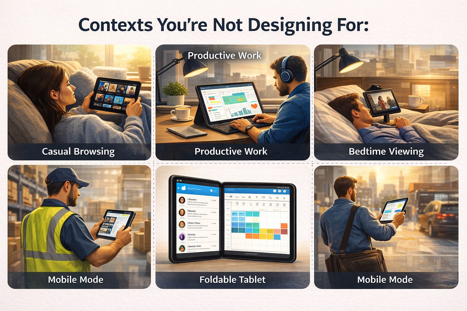
Context 1: The “in-between” device → Tablets
Tablets are weird because people use them in multiple postures and contexts:
On the couch, casually browsing (consumption mode)
At a desk with a keyboard, working (productivity mode)
In bed, propped up on a stand (passive mode)
In hand, walking around a warehouse or hospital (mobile mode)
Your design needs to work in all of these. A tablet user might want desktop-level functionality but with touch-friendly targets. They might need to see more information than a phone but can’t use hover states.
What fails: Assuming tablet = scaled-up phone. Tablets have more screen space. Use it. Multi-column layouts. Side-by-side views. Toolbars that stay visible. (Source: Apple Human Interface Guidelines - iPadOS)
Context 2: The “desk-but-touch” device → Surface, Chromebook, touchscreen laptops
These devices break your assumptions about input methods. They have large screens (desktop-sized) but are often used with touch. Your hover states don’t work. Your small click targets are hard to tap. Your right-click menus are inaccessible.
What fails: Relying on mouse-specific interactions. Designing buttons smaller than 44x44px because “it’s desktop.” Putting critical actions in hover-only states.
Context 3: The “sometimes folded” device → Foldables
Samsung Z Fold, Google Pixel Fold, and others. These devices switch from phone-sized to tablet-sized mid-session. Your app needs to gracefully handle the screen size changing without losing the user’s place or breaking the layout.
What fails: Fixed layouts that don’t reflow. Modals that assume screen dimensions. Video players that don’t adapt. (Source: Samsung Developer Docs)
Context 4: The “giant desktop” → Ultra-wide and multi-monitor setups
People run your web app on 34-inch curved monitors or across multiple displays. If your max-width is 1440px, you’re wasting 70% of their screen. Everything feels small and cramped in the center.
What fails: Arbitrary max-widths without considering actual large-screen usage. Not designing for when users want to see more information at once.
Context 5: The “actual mobile” context → Moving, one-handed, distracted
This is what mobile-first was supposed to optimize for, but many “mobile” designs are tested sitting at a desk. Real mobile usage happens while walking, on the bus, holding coffee, in bright sunlight.
What fails: Small touch targets. Low contrast. Actions requiring two hands. Multi-step flows that require focus.
Responsive design vs. adaptive design (and when each matters)
Let’s clarify these terms, because they get used interchangeably but they’re different approaches.
Responsive design = fluid layouts that stretch and compress based on viewport width. Same HTML, same components, just rearranged with CSS. This is what most teams do.
Adaptive design = different layouts or even different components for different contexts. You might show a completely different navigation pattern on mobile vs desktop, or different information density.
When responsive works well:
✅ Content-heavy sites where the information hierarchy is consistent across devices (blogs, news, documentation)
✅ Simple layouts that don’t need dramatically different structures
✅ When development resources are limited and you need one codebase
When responsive fails:
❌ Complex applications where mobile and desktop have fundamentally different use cases
❌ When the same information density doesn’t work across all screen sizes
❌ When touch vs mouse input requires different interaction patterns
When you need adaptive:
✅ Productivity tools where desktop users need power features and mobile users need quick actions
✅ When different devices are used in genuinely different contexts (e.g., managers use desktop for analysis, field workers use phones for data entry)
✅ When you can justify the extra development cost for significantly better experiences
The hybrid approach that works: Responsive layout structure with adaptive components. Your grid system responds to screen size, but individual components might render differently based on input method or context.
Example: A data table is responsive in its column widths, but adaptively switches to cards on small screens because tables don’t work well in narrow viewports.
How to actually test across real device usage
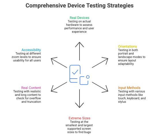
This is where most teams fall short. They design in Figma at standard breakpoints, test in Chrome DevTools device mode, and call it done. That’s not enough.
Here’s what comprehensive device testing actually looks like:
1. Test on real devices, not just simulators
DevTools responsive mode is useful for quick checks, but it doesn’t show you:
Actual performance and load times
Touch target accuracy
How readable text is on a real screen
Gesture interactions (pinch to zoom, swipe, etc.)
How bright/dark your UI is in different lighting
Get your hands on: An iPhone, an Android phone, an iPad, a cheap Android tablet, and if possible, a foldable device. You don’t need every device, but test on actual hardware regularly.
2. Test in both orientations
Portrait and landscape can have very different implications for your layout. Landscape on a phone often reveals layout issues you didn’t catch. Portrait on a tablet might show wasted space.
Build this into your workflow: Every time you test a screen, rotate the device. This takes 5 seconds and catches so many issues.
3. Test with actual input methods
Use your finger, not a mouse cursor pretending to be a finger. Try navigating with a keyboard. Try using a stylus if your users might. Try your app with a trackpad, with a mouse, with touch.
What you’ll discover: That hover state you relied on doesn’t work with touch. That drag interaction is awkward with a trackpad. That button is too small to tap accurately.
4. Test at the extremes
Don’t just test at your breakpoints. Test at the smallest screen you support and the largest. Test at weird in-between sizes like 950px or 1180px. This is where breakpoint bugs hide.
5. Test with real content, especially long content
Don’t test with “Lorem ipsum” or “Jane Smith.” Test with:
A really long name: “Dr. María José Fernández-González”
A really long title: “Senior Vice President of Digital Transformation and Customer Experience”
Lots of items: 47 notifications, 200 emails, 12 tabs open
No items: empty states with no data
What breaks: Truncation that cuts off important info. Layouts that overflow. Infinite scrolling that performs badly. Empty states nobody designed for.
6. Use accessibility tools to test at different zoom levels
Many users zoom to 200% or more. Your layout should still be usable. Text should reflow, not disappear off screen. Buttons should stay tappable.
Test this by: Zooming your browser to 200% and trying to complete core tasks. (Source: WCAG 2.1 Guidelines)
🎯 Take-home: You can’t design for screens you’ve never actually used. Budget for real devices and test on them regularly.
📦 Resource Corner
Statcounter Global Stats Live data on actual screen resolutions and device usage worldwide. Updates monthly. Use this to inform your breakpoint decisions based on real usage, not assumptions.
Responsively App Free tool that lets you preview your site on multiple device sizes simultaneously. Way better than toggling device mode in DevTools.
Apple Human Interface Guidelines Comprehensive guidance on designing for iOS, iPadOS, and macOS. Especially strong on adaptive layouts and input methods.
Google Material Design - Adaptive Design Material’s approach to responsive and adaptive layouts, including their window size class system.
Can I Use Check browser support for CSS features before relying on them for responsive layouts. Saved me many times.
BrowserStack Paid service but worth it for testing on real devices in the cloud. Good for testing devices you don’t own.
The New CSS for Responsive Design (Every Layout) Modern CSS layout primitives that make responsive design more robust. Moves beyond breakpoint-heavy approaches.
Final Thought
The phrase “mobile-first” was never meant to be “mobile-only.” It was about starting with constraints and progressively enhancing. But somewhere along the way, teams started treating other screen sizes as afterthoughts.
The reality is messier than our breakpoints suggest. People switch devices mid-task. They rotate their phones. They use tablets like laptops and laptops like tablets. They have giant monitors and tiny phones and weird foldable things in between.
Your job isn’t to design for three breakpoints. It’s to design for the contexts where your product actually gets used, on the devices people actually have, with the input methods they actually prefer.
That’s harder than slapping some media queries on a mobile design and calling it responsive. But it’s also what separates products that feel native to each context from ones that feel like they’re fighting against the device.

